Lesson: Using Swing Components
Section: How to Use Various Components
The Java Tutorials have been written for JDK 8.Java教程是为JDK 8编写的。Examples and practices described in this page don't take advantage of improvements introduced in later releases and might use technology no longer available.本页中描述的示例和实践没有利用后续版本中引入的改进,并且可能使用不再可用的技术。See Java Language Changes for a summary of updated language features in Java SE 9 and subsequent releases.有关Java SE 9及其后续版本中更新的语言特性的摘要,请参阅Java语言更改。
See JDK Release Notes for information about new features, enhancements, and removed or deprecated options for all JDK releases.有关所有JDK版本的新功能、增强功能以及已删除或不推荐的选项的信息,请参阅JDK发行说明。
How to Use Tool Bars如何使用工具栏
A JToolBar is a container that groups several components — usually buttons with icons — into a row or column. JToolBar是将若干组件分组的容器;通常是带有图标的按钮;成一行或列。Often, tool bars provide easy access to functionality that is also in menus. 通常,工具栏可以方便地访问菜单中的功能。How to Use Actions如何使用动作 describes how to provide the same functionality in menu items and tool bar buttons.描述如何在菜单项和工具栏按钮中提供相同的功能。
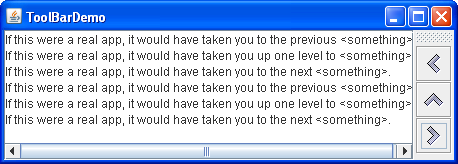
The following images show an application named 下图显示了名为ToolBarDemo that contains a tool bar above a text area. ToolBarDemo的应用程序,该应用程序包含文本区域上方的工具栏。Click the Launch button to run ToolBarDemo using Java™ Web Start (download JDK 7 or later). 单击启动按钮,使用Java™Web启动运行工具栏演示(下载JDK 7或更高版本)。Alternatively, to compile and run it yourself, consult the example index.或者,要自己编译和运行它,请参考示例索引。


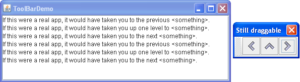
By default, the user can drag the tool bar to another edge of its container or out into a window of its own. 默认情况下,用户可以将工具栏拖动到其容器的另一个边缘,或拖动到其自己的窗口中。The next figure shows how the application looks after the user has dragged the tool bar to the right edge of its container.下图显示了用户将工具栏拖到其容器的右边缘后应用程序的外观。
For the drag behavior to work correctly, the tool bar must be in a container that uses the 要使拖动行为正常工作,工具栏必须位于使用BorderLayout layout manager. BorderLayout布局管理器的容器中。The component that the tool bar affects is generally in the center of the container. 工具栏影响的组件通常位于容器的中心。The tool bar must be the only other component in the container, and it must not be in the center.工具栏必须是容器中唯一的其他组件,并且不能位于中心。
The next figure shows how the application looks after the user has dragged the tool bar outside its window.下图显示了用户将工具栏拖出窗口后应用程序的外观。
The following code creates the tool bar and adds it to a container. 以下代码创建工具栏并将其添加到容器中。You can find the entire program in 您可以在ToolBarDemo.java.ToolBarDemo.java中找到整个程序。
public class ToolBarDemo extends JPanel
                         implements ActionListener {
    ...
    public ToolBarDemo() {
        super(new BorderLayout());
        ...
        JToolBar toolBar = new JToolBar("Still draggable");
        addButtons(toolBar);
        ...
        setPreferredSize(new Dimension(450, 130));
        add(toolBar, BorderLayout.PAGE_START);
        add(scrollPane, BorderLayout.CENTER);
    }
    ...
}
This code positions the tool bar above the scroll pane by placing both components in a panel controlled by a border layout, with the tool bar in the 该代码通过将两个组件放置在由边框布局控制的面板中,工具栏位于PAGE_START position and the scroll pane in the CENTER position. PAGE_START位置,滚动窗格位于CENTER位置,从而将工具栏定位在滚动窗格上方。Because the scroll pane is in the center and no other components except the tool bar are in the container, by default the tool bar can be dragged to other edges of the container. 由于滚动窗格位于中心,并且除了工具栏之外,容器中没有其他组件,因此默认情况下,工具栏可以拖动到容器的其他边缘。The tool bar can also be dragged out into its own window, in which case the window has the title "Still draggable", as specified by the 工具栏也可以拖出到自己的窗口中,在这种情况下,窗口的标题为“仍然可拖拽”,如JToolBar constructor.JToolBar构造函数所指定的。
Creating Tool Bar Buttons创建工具栏按钮
The buttons in the tool bar are ordinary 工具栏中的按钮是普通的JButton instances that use images from the Java Look and Feel Graphics Repository. JButton实例,使用Java外观图形库中的图像。Use images from the Java Look and Feel Graphics Repository if your tool bar has the Java look and feel.如果工具栏具有Java外观,请使用Java外观图形库中的图像。
Here is the code that creates the buttons and adds them to the tool bar.下面是创建按钮并将其添加到工具栏的代码。
protected void addButtons(JToolBar toolBar) {
    JButton button = null;

    //first button
    button = makeNavigationButton("Back24", PREVIOUS,
                                  "Back to previous something-or-other",
                                  "Previous");
    toolBar.add(button);

    //second button
    button = makeNavigationButton("Up24", UP,
                                  "Up to something-or-other",
                                  "Up");
    toolBar.add(button);

    ...//similar code for creating and adding the third button...
}

protected JButton makeNavigationButton(String imageName,
                                       String actionCommand,
                                       String toolTipText,
                                       String altText) {
    //Look for the image.
    String imgLocation = "images/"
                         + imageName
                         + ".gif";
    URL imageURL = ToolBarDemo.class.getResource(imgLocation);

    //Create and initialize the button.
    JButton button = new JButton();
    button.setActionCommand(actionCommand);
    button.setToolTipText(toolTipText);
    button.addActionListener(this);

    if (imageURL != null) {                      //image found
        button.setIcon(new ImageIcon(imageURL, altText));
    } else {                                     //no image found
        button.setText(altText);
        System.err.println("Resource not found: " + imgLocation);
    }

    return button;
}
The first call to 对makeNavigationButton creates the image for the first button, using the 24x24 "Back" navigation image in the graphics repository.makeNavigationButton的第一次调用使用图形库中的24x24“后退”导航图像创建第一个按钮的图像。
Besides finding the image for the button, the 除了查找按钮的图像,makeNavigationButton method also creates the button, sets the strings for its action command and tool tip text, and adds the action listener for the button. makeNavigationButton方法还创建按钮,为其操作命令和工具提示文本设置字符串,并为按钮添加操作侦听器。If the image is missing, the method prints an error message and adds text to the button, so that the button is still usable.如果图像丢失,该方法将打印错误消息并向按钮添加文本,以便按钮仍然可用。
Note:
If any buttons in your tool bar duplicate the functionality of other components, such as menu items, you should probably create and add the tool bar buttons as described in How to Use Actions.如果工具栏中的任何按钮复制了其他组件(如菜单项)的功能,您可能应该创建并添加工具栏按钮,如如何使用操作中所述。
Customizing Tool Bars自定义工具栏
By adding a few lines of code to the preceding example, we can demonstrate some more tool bar features:通过在前面的示例中添加几行代码,我们可以演示更多的工具栏功能:
Using使用setFloatable(false)to make a tool bar immovable.setFloatable(false)使工具栏不可移动。Using使用setRollover(true)to visually indicate tool bar buttons when the user passes over them with the cursor.setRollover(true)在用户用光标经过工具栏按钮时直观地指示工具栏按钮。Adding a separator to a tool bar.向工具栏添加分隔符。Adding a non-button component to a tool bar.将非按钮组件添加到工具栏。
You can see these features by running ToolBarDemo2. 您可以通过运行ToolBarDemo2来查看这些功能。Click the Launch button to run ToolBarDemo2 using Java™ Web Start (download JDK 7 or later). 单击启动按钮,使用Java™Web启动运行ToolBarDemo2(下载JDK 7或更高版本)。Alternatively, to compile and run it yourself, consult the example index.或者,要自己编译和运行它,请参考示例索引。
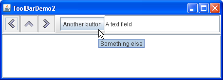
You can find the entire code for this program in 您可以在ToolBarDemo2.java. ToolBarDemo2.java中找到该程序的完整代码。Below you can see a picture of a new UI using these customized features.下面您可以看到使用这些自定义功能的新UI的图片。
Because the tool bar can no longer be dragged, it no longer has bumps at its left edge. Here is the code that turns off dragging:由于无法再拖动工具栏,因此其左边缘不再有凹凸。以下是关闭拖动的代码:
toolBar.setFloatable(false);
The tool bar is in rollover mode, so the button under the cursor has a visual indicator. 工具栏处于滚动模式,因此光标下的按钮具有可视指示器。The kind of visual indicator depends on the look and feel. 视觉指示器的类型取决于外观和感觉。For example, the Metal look and feel uses a gradient effect to indicate the button under the cursor while other types of look and feel use borders for this purpose. 例如,金属外观使用渐变效果来指示光标下的按钮,而其他类型的外观使用边框。Here is the code that sets rollover mode:以下是设置翻转模式的代码:
toolBar.setRollover(true);
Another visible difference in the example above is that the tool bar contains two new components, which are preceded by a blank space called a separator. 上述示例中的另一个明显区别是工具栏包含两个新组件,它们前面有一个称为分隔符的空白。Here is the code that adds the separator:下面是添加分隔符的代码:
toolBar.addSeparator();
Here is the code that adds the new components:下面是添加新组件的代码:
//fourth button
button = new JButton("Another button");
...
toolBar.add(button);

//fifth component is NOT a button!
JTextField textField = new JTextField("A text field");
...
toolBar.add(textField);
You can easily make the tool bar components either top-aligned or bottom-aligned instead of centered by invoking the 通过调用setAlignmentY method. setAlignmentY方法,可以轻松地使工具栏组件顶部对齐或底部对齐,而不是居中对齐。For example, to align the tops of all the components in a tool bar, invoke 例如,要对齐工具栏中所有组件的顶部,请在每个组件上调用setAlignmentY(TOP_ALIGNMENT) on each component. setAlignmentY(TOP_ALIGNMENT)。Similarly, you can use the 同样,当工具栏垂直时,可以使用setAlignmentX method to specify the alignment of components when the tool bar is vertical. setAlignmentX方法指定零部件的对齐。This layout flexibility is possible because tool bars use 这种布局灵活性是可能的,因为工具栏使用BoxLayout to position their components. BoxLayout来定位其组件。For more information, see How to Use BoxLayout.有关更多信息,请参阅如何使用BoxLayout。
The Tool Bar API工具栏API
The following table lists the commonly used 下表列出了常用的JToolBar constructors and methods. JToolBar构造函数和方法。Other methods you might call are listed in the API tables in The JComponent Class.您可能调用的其他方法列在JComponent类的API表中。
JToolBar()JToolBar(int)JToolBar(String)JToolBar(String, int) |
HORIZONTAL. HORIZONTAL。String parameter allows you to specify the title of the tool bar's window if it is dragged outside of its container.String参数允许您指定工具栏窗口的标题(如果将其拖动到其容器之外)。 |
Component add(Component) |
|
void addSeparator() |
|
void setFloatable(boolean)boolean isFloatable() |
true,表示用户可以将工具栏拖动到单独的窗口中。toolBar.setFloatable(false). toolBar.setFloatable(false)。 |
void setRollover(boolean)boolean isRollover() |
false。true。 |
Examples That Use Tool Bars使用工具栏的示例
This table lists examples that use 下表列出了使用JToolBar and points to where those examples are described.JToolBar的示例,并指出了这些示例的描述位置。
ToolBarDemo |
||
ToolBarDemo2 |
||
ActionDemo |
How to Use Actions |
Action objects.Action对象实现工具栏。 |