Lesson: Using Swing Components
Section: How to Use Various Components
The Java Tutorials have been written for JDK 8.Java教程是为JDK 8编写的。Examples and practices described in this page don't take advantage of improvements introduced in later releases and might use technology no longer available.本页中描述的示例和实践没有利用后续版本中引入的改进,并且可能使用不再可用的技术。See Java Language Changes for a summary of updated language features in Java SE 9 and subsequent releases.有关Java SE 9及其后续版本中更新的语言特性的摘要,请参阅Java语言更改。
See JDK Release Notes for information about new features, enhancements, and removed or deprecated options for all JDK releases.有关所有JDK版本的新功能、增强功能以及已删除或不推荐的选项的信息,请参阅JDK发行说明。
How to Use Split Panes如何使用拆分窗格
A JSplitPane displays two components, either side by side or one on top of the other. JSplitPane显示两个组件,要么并排显示,要么一个在另一个之上。By dragging the divider that appears between the components, the user can specify how much of the split pane's total area goes to each component. 通过拖动组件之间出现的分隔线,用户可以指定拆分窗格的总面积中有多少分配给每个组件。You can divide screen space among three or more components by putting split panes inside of split panes, as described in Nesting Split Panes.通过将拆分窗格放置在拆分窗格中,可以在三个或更多组件之间划分屏幕空间,如嵌套拆分窗格中所述。
Instead of adding the components of interest directly to a split pane, you often put each component into a scroll pane. 您通常将每个组件放在滚动窗格中,而不是将感兴趣的组件直接添加到拆分窗格中。You then put the scroll panes into the split pane. 然后将滚动窗格放入拆分窗格。This allows the user to view any part of a component of interest, without requiring the component to take up a lot of screen space or adapt to displaying itself in varying amounts of screen space.这允许用户查看感兴趣组件的任何部分,而无需组件占用大量屏幕空间或适应在不同数量的屏幕空间中显示自身。
Here's a picture of an application that uses a split pane to display a list and an image side by side:下面是一个应用程序的图片,它使用拆分窗格并排显示列表和图像:
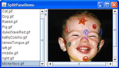
Try this:
Click the Launch button to run the SplitPaneDemo using Java™ Web Start (download JDK 7 or later).单击启动按钮,使用Java™ Web StartJava™Web启动运行SplitPaneDemo(下载JDK 7或更高版本)。Alternatively, to compile and run the example yourself, consult the example index.或者,要自己编译和运行示例,请参考示例索引。
Drag the dimpled line that divides the list and the image to the left or right.向左或向右拖动分隔列表和图像的带酒窝线。Try to drag the divider all the way to the window's edge.尝试将分隔线一直拖动到窗口边缘。Click the tiny arrows on the divider to hide/expand the left or right component.单击分隔器上的小箭头以隐藏/展开左侧或右侧组件。
Below is the code from 下面是SplitPaneDemo that creates and sets up the split pane.SplitPaneDemo中创建和设置拆分窗格的代码。
//Create a split pane with the two scroll panes in it.
splitPane = new JSplitPane(JSplitPane.HORIZONTAL_SPLIT,
                           listScrollPane, pictureScrollPane);
splitPane.setOneTouchExpandable(true);
splitPane.setDividerLocation(150);

//Provide minimum sizes for the two components in the split pane
Dimension minimumSize = new Dimension(100, 50);
listScrollPane.setMinimumSize(minimumSize);
pictureScrollPane.setMinimumSize(minimumSize);
The constructor used by this example takes three arguments. 本例使用的构造函数有三个参数。The first indicates the split direction. 第一个指示分裂方向。The other arguments are the two components to put in the split pane. 其他参数是要放在拆分窗格中的两个组件。Refer to Setting the Components in a Split Pane for information about 有关动态设置组件的JSplitPane methods that set the components dynamically.JSplitPane方法的信息,请参阅在拆分窗格中设置组件。
The split pane in this example is split horizontally — the two components appear side by side — as specified by the 该示例中的分割窗格被水平分割;这两个组件并排出现;如构造函数的JSplitPane.HORIZONTAL_SPLIT argument to the constructor. JSplitPane.HORIZONTAL_SPLIT参数所指定。Split pane provides one other option, specified with 拆分窗格提供了另一个选项,该选项由JSplitPane.VERTICAL_SPLIT, that places one component above the other. JSplitPane.VERTICAL_SPLIT指定,用于将一个组件置于另一个组件之上。You can change the split direction after the split pane has been created with the 使用setOrientation method.setOrientation方法创建拆分窗格后,可以更改拆分方向。
Two small arrows appear at the top of the divider in the example's split pane. 在示例的拆分窗格中,分隔符的顶部出现两个小箭头。These arrows let the user collapse (and then expand) either of the components with a single click. 通过这些箭头,用户只需单击一次,即可折叠(然后展开)任一组件。The current look and feel determines whether these controls appear by default. 当前外观决定这些控件是否默认显示。In the Java look and feel, they are turned off by default. (Note that not all look and feels support this.) 在Java外观中,它们在默认情况下是关闭的。(请注意,并非所有外观和感觉都支持这一点。)The example turned them on using the 示例使用setOneTouchExpandable method.setOneTouchExpandable方法打开了它们。
The range of a split pane's divider is determined in part by the minimum sizes of the components within the split pane. 拆分窗格的分隔线范围部分由拆分窗格中组件的最小尺寸确定。See Positioning the Divider and Restricting its Range for details.有关详细信息,请参阅定位分隔器并限制其范围。
The rest of this section covers these topics:本节其余部分涵盖以下主题:
Setting the Components in a Split Pane在拆分窗格中设置组件Positioning the Divider and Restricting its Range定位分隔器并限制其范围Nesting Split Panes嵌套拆分窗格The Split Pane API拆分窗格APIExamples that Use Split Panes使用拆分窗格的示例
Setting the Components in a Split Pane在拆分窗格中设置组件
A program can set a split pane's two components dynamically with these four methods:程序可以使用以下四种方法动态设置拆分窗格的两个组件:
setLeftComponentsetRightComponentsetTopComponentsetBottomComponent
You can use any of these methods at any time regardless of the split pane's current split direction. 无论拆分窗格的当前拆分方向如何,您都可以随时使用这些方法。Calls to 对setLeftComponent and setTopComponent are equivalent and set the specified component in the top or left position, depending on the split pane's current split orientation. setLeftComponent和setTopComponent的调用是等效的,并将指定组件设置在顶部或左侧位置,具体取决于拆分窗格的当前拆分方向。Similarly, calls to 类似地,对setRightComponent and setBottomComponent are equivalent. setRightComponent和setBottomComponent的调用是等效的。These methods replace whatever component is already in that position with the new one.这些方法用新的组件替换已经处于该位置的组件。
Like other containers, 与其他容器一样,JSplitPane supports the add method. JSplitPane支持add方法。Split pane puts the first component added in the left or top position. 拆分窗格将添加的第一个组件置于左侧或顶部位置。The danger of using 使用add is that you can inadvertently call it too many times, in which case the split pane's layout manager will throw a rather esoteric-looking exception. add的危险在于,您可能会不经意地调用它太多次,在这种情况下,拆分窗格的布局管理器将抛出一个看起来相当神秘的异常。If you are using the 如果使用add method and a split pane is already populated, you first need to remove the existing components with remove.add方法,并且已填充拆分窗格,则首先需要使用remove删除现有组件。
If you put only one component in a split pane, then the divider will be stuck at the right side or the bottom of the split pane, depending on its split direction.如果在拆分窗格中仅放置一个组件,则分隔符将被固定在拆分窗格的右侧或底部,具体取决于其拆分方向。
Positioning the Divider and Restricting Its Range定位分隔器并限制其范围
To make your split pane work well, you often need to set the minimum sizes of components in the split pane, as well as the preferred size of either the split pane or its contained components. 要使拆分窗格正常工作,通常需要设置拆分窗格中组件的最小大小,以及拆分窗格或其包含组件的首选大小。Choosing which sizes you should set is an art that requires understanding how a split pane's preferred size and divider location are determined. Before we get into details, let's take another look at SplitPaneDemo. 选择应设置的大小是一门艺术,需要了解如何确定拆分窗格的首选大小和分隔位置。在我们进入细节之前,让我们再看看SplitPaneDemo。Or, if you're in a hurry, you can skip to the list of rules.或者,如果您赶时间,可以跳到规则列表。
Try this:
Click the Launch button to run the SplitPaneDemo using Java™ Web Start (download JDK 7 or later).单击启动按钮,使用Java™Web启动运行SplitPaneDemo(下载JDK 7或更高版本)。Alternatively, to compile and run the example yourself, consult the example index.或者,要自己编译和运行示例,请参考示例索引。
Because the size of the demo's frame is set using the因为演示框架的大小是使用packmethod, the split pane is at its preferred size, which SplitPaneDemo happens to set explicitly.pack方法设置的,所以拆分窗格的大小是其首选大小,而SplitPaneDemo恰好是显式设置的。The divider is automatically placed so that the left component is at its preferred width and all remaining space goes to the right component.分隔器将自动放置,以使左侧组件处于其首选宽度,所有剩余空间都将流向右侧组件。Make the window wider.把窗户开大些。
The divider stays where it is, and the extra space goes to the component at the right.分隔符保持在原来的位置,多余的空间将分配给右边的组件。Make the window noticeably narrower than when it first came up — perhaps twice as wide as the left component.使窗口比第一次出现时明显变窄—可能是左组件的两倍宽。
Again, the left component's size and the divider position stay the same.同样,左侧组件的大小和分隔器位置保持不变。Only the size of the right component changes.只有正确组件的大小发生变化。Make the window as narrow as possible.把窗户尽量窄些。
Assuming the window uses the Java look and feel-provided decorations, you cannot size the window smaller than the split pane's minimum size, which is determined by the minimum size of the components contained by the split pane.假设窗口使用Java外观提供的装饰,则窗口的大小不能小于拆分窗格的最小大小,该最小大小由拆分窗格包含的组件的最小大小决定。SplitPaneDemo sets the minimum size of these contained components explicitly.SplitPaneDemo显式设置这些包含组件的最小大小。Make the window wider, and then drag the divider as far as it will go to the right.使窗口更宽,然后将分隔线拖到最右侧。
The divider goes only as far as the right component's minimum size allows.分隔器仅在正确组件的最小尺寸允许的范围内。If you drag the divider to the left, you'll see that it also respects the left component's minimum size.如果将分隔线拖动到左侧,您将看到它也符合左侧组件的最小尺寸。
Now that you've seen the default behavior of split panes, we can tell you what's happening behind the scenes and how you can affect it. 现在您已经看到了拆分窗格的默认行为,我们可以告诉您幕后发生了什么,以及您如何影响它。In this discussion, when we refer to a component's preferred or minimum size, we often mean the preferred or minimum width of the component if the split pane is horizontal, or its preferred or minimum height if the split pane is vertical.在本讨论中,当我们提到组件的首选或最小尺寸时,我们通常指的是组件的首选宽度或最小宽度(如果拆分窗格是水平的),或其首选或最小高度(如果拆分面板是垂直的)。
By default, a split pane's preferred size and divider location are initialized so that the two components in the split pane are at their preferred sizes. 默认情况下,将初始化拆分窗格的首选大小和分隔符位置,以便拆分窗格中的两个组件处于其首选大小。If the split pane isn't displayed at this preferred size and the program hasn't set the divider's location explicitly, then the initial position of the divider (and thus the sizes of the two components) depends on a split pane property called the resize weight. 如果拆分窗格未按此首选大小显示,并且程序未明确设置分隔符的位置,则分隔符的初始位置(以及两个组件的大小)取决于称为“调整大小权重”的拆分窗格属性。If the split pane is initially at its preferred size or bigger, then the contained components start out at their preferred sizes, before adjusting for the resize weight. 如果拆分窗格最初为其首选大小或更大,则包含的组件将在调整大小权重之前以其首选大小开始。If the split pane is initially too small to display both components at their preferred sizes, then they start out at their minimum sizes, before adjusting for the resize weight.如果拆分窗格最初太小,无法以其首选尺寸显示两个组件,则在调整大小权重之前,它们将以最小尺寸开始。
A split pane's resize weight has a value between 0.0 and 1.0 and determines how space is distributed between the two contained components when the split pane's size is set — whether programmatically or by the user resizing the split pane (enlarging its containing window, for example). 分割窗格的调整大小权重的值介于0.0和1.0之间,并确定当分割窗格的大小设置为;无论是通过编程方式还是通过用户调整拆分窗格的大小(例如,放大其包含的窗口)。The resize weight of a split pane is 0.0 by default, indicating that the left or top component's size is fixed, and the right or bottom component adjusts its size to fit the remaining space. 默认情况下,拆分窗格的调整大小权重为0.0,表示左侧或顶部组件的大小是固定的,右侧或底部组件调整其大小以适应剩余空间。Setting the resize weight to 0.5 splits any extra or missing space evenly between the two components. 将“调整大小权重”设置为0.5将在两个组件之间均匀分割任何多余或缺失的空间。Setting the resize weight to 1.0 makes the right or bottom component's size remain fixed. 将“调整大小权重”设置为1.0将使右侧或底部组件的大小保持固定。The resize weight has no effect, however, when the user drags the divider.但是,当用户拖动分隔符时,调整大小权重没有影响。
The user can drag the divider to any position as long as neither contained component goes below its minimum size. 用户可以将分隔器拖动到任何位置,只要包含的组件都不低于其最小尺寸。If the divider has one-touch buttons, the user can use them to make the divider move completely to one side or the other — no matter what the minimum sizes of the components are.如果分隔器具有单触按钮,则用户可以使用它们使分隔器完全移动到一侧或另一侧;无论组件的最小尺寸是多少。
Now that you know the factors that affect a split pane's size and divider location, here are some rules for making them work well:现在您已经知道了影响拆分窗格大小和分隔符位置的因素,下面是一些使其正常工作的规则:
To ensure that the divider can be dragged when the split pane is at its preferred size, make sure the minimum size of one or both contained components is smaller than the contained component's preferred size.为了确保分割窗格处于其首选大小时可以拖动分隔符,请确保一个或两个包含组件的最小大小小于包含组件的首选大小。You can set the minimum size of a component either by invoking您可以通过对组件调用setMinimumSizeon it or by overriding itsgetMinimumSizemethod.setMinimumSize或重写其getMinimumSize方法来设置组件的最小大小。For example, if you want the user to be able to drag the divider all the way to both sides:例如,如果希望用户能够将分隔线一直拖到两侧:Dimension minimumSize = new Dimension(0, 0); leftComponent.setMinimumSize(minimumSize); rightComponent.setMinimumSize(minimumSize);
To guarantee that both contained components appear, make sure that either the split pane is initially at or above its preferred size, or the minimum sizes of the contained components are greater than zero.要确保两个包含的组件都出现,请确保拆分窗格最初处于或高于其首选大小,或者包含的组件的最小大小大于零。This should usually happen if the splitpane is given its preferred size, which depends upon the layout manager containing the split pane.如果为拆分窗格指定了其首选大小,这通常会发生,这取决于包含拆分窗格的布局管理器。Another option is to explicitly set a preferred size on the split pane that is larger than the size of the contained components.另一个选项是在拆分窗格上显式设置大于所包含组件大小的首选大小。If you want the bottom or right component to stay the same size and the top or left component to be flexible when the split pane gets bigger, set the resize weight to 1.0.如果希望在拆分窗格变大时,底部或右侧组件保持相同大小,顶部或左侧组件保持灵活,请将“调整大小权重”设置为1.0。You can do this by invoking您可以通过调用setResizeWeight:setResizeWeight来实现这一点:splitPane.setResizeWeight(1.0);
If you want both halves of the split pane to share in the split pane's extra or removed space, set the resize weight to 0.5:如果希望拆分窗格的两半共享拆分窗格的额外或移除空间,请将“调整大小权重”设置为0.5:splitPane.setResizeWeight(0.5);
Make sure each component contained by a split pane has a reasonable preferred size.确保拆分窗格中包含的每个组件具有合理的首选大小。If the component is a panel that uses a layout manager, you can generally just use the value it returns.如果组件是使用布局管理器的面板,则通常可以只使用它返回的值。If the component is a scroll pane, you have a few choices.如果组件是滚动窗格,则有几个选择。You can invoke the您可以在滚动窗格上调用setPreferredSizemethod on the scroll pane, invoke the appropriate method on the component in the scroll pane (such as thesetVisibleRowCountmethod forJListorJTree).setPreferredSize方法,在滚动窗格中的组件上调用适当的方法(如JList或JTree的setVisibleRowCount方法)。Make sure each component contained by a split pane can display itself reasonably in varying amounts of space.确保拆分窗格中包含的每个组件可以在不同的空间中合理地显示自己。For example, panels that contain multiple components should use layout managers that use extra space in a reasonable way.例如,包含多个组件的面板应使用布局管理器,以合理的方式使用额外空间。If you want to set the size of contained components to something other than their preferred sizes, use the如果要将包含的组件的大小设置为其首选大小以外的其他大小,请使用setDividerLocationmethod.setDividerLocation方法。For example, to make the left component 150 pixels wide:例如,为了使左分量宽150像素:splitPane.setDividerLocation(150 + splitPane.getInsets().left);
Although the split pane does its best to honor the initial divider location (150 in this case), once the user drags the divider it may no longer be possible to drag to the programmatically specified size.尽管分割窗格尽其所能地遵守初始分隔符位置(在本例中为150),但一旦用户拖动分隔符,则可能无法再拖动到编程指定的大小。To make the right component 150 pixels wide:要使右组件宽150像素:splitPane.setDividerLocation(splitPane.getSize().width - splitPane.getInsets().right - splitPane.getDividerSize() - 150);If the split pane is already visible, you can set the divider location as a percentage of the split pane.如果拆分窗格已可见,则可以将分隔符位置设置为拆分窗格的百分比。For example, to make 25% of the space go to left/top:例如,要使25%的空间位于左侧/顶部:splitPane.setDividerLocation(0.25);
Note that this is implemented in terms of the current size and is therefore really only useful if the split pane is visible.请注意,这是根据当前大小实现的,因此只有在拆分窗格可见时才真正有用。To lay out the split pane as if it just came up, likely repositioning the divider in the process, invoke若要将拆分窗格布置得像刚出现一样,并可能在过程中重新定位分隔符,请在拆分窗格上调用resetToPreferredSizes()on the split pane.resetToPreferredSizes()。
Note:Just changing the contained components' preferred sizes — even if you invoke仅改变所包含组件的优选尺寸;即使您随后调用revalidateafterwards — is not enough to cause the split pane to lay itself out again.revalidate—不足以使拆分窗格重新布局。You must invoke您还必须调用resetToPreferredSizesas well.resetToPreferredSizes。
The following snapshot shows an example named SplitPaneDividerDemo that demonstrates split pane component sizes and divider placement.下面的快照显示了名为SplitPaneDividerDemo的示例,该示例演示了拆分窗格组件大小和分隔器放置。
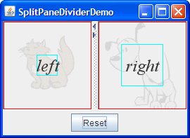
Like SplitPaneDemo, SplitPaneDividerDemo features a horizontal split pane with one-touch buttons. 与SplitPaneDemo类似,SplitPanedViderDemo具有带有一键式按钮的水平拆分窗格。SplitPaneDividerDemo has the following additional features:SplitPaneDividerDemo具有以下附加功能:
The split pane's resize weight is explicitly set (to 0.5).拆分窗格的调整大小权重显式设置(0.5)。The split pane is displayed at its default preferred size.拆分窗格以其默认首选大小显示。A Reset button at the bottom of the window invokes窗口底部的重置按钮调用拆分窗格上的resetToPreferredSizeson the split pane.resetToPreferredSizes。The components in the split pane are instances of a custom拆分窗格中的组件是名为JComponentsubclass calledSizeDisplayer.SizeDisplayer的自定义JComponent子类的实例。ASizeDisplayerdisplays optional text against the background of a faded (and also optional) image.SizeDisplayer在褪色(也是可选)图像的背景下显示可选文本。More importantly, it has rectangles that show its preferred and minimum sizes.更重要的是,它具有显示其首选和最小尺寸的矩形。SplitPaneDividerDemo sets up itsSplitPaneDividerDemo将其SizeDisplayers to have equal preferred sizes (due to the equally large images they show) but unequal minimum sizes.SizeDisplayer设置为具有相等的首选大小(由于它们显示的图像同样大),但最小大小不相等。
Try this:
Click the Launch button to run the SplitPaneDividerDemo using Java™ Web Start (download JDK 7 or later).单击启动按钮,使用Java™Web启动运行SplitPaneDividerDemo(下载JDK 7或更高版本)。Alternatively, to compile and run the example yourself, consult the example index.或者,要自己编译和运行示例,请参考示例索引。
Because the size of the demo's frame is set using the因为演示框架的大小是使用packmethod, the split pane is at its preferred size, which by default is just big enough for theSizeDisplayers to be at their preferred sizes.pack方法设置的,所以拆分窗格的大小是其首选大小,默认情况下,该大小刚好足以使SizeDisplayer处于其首选大小。The preferred size of each每个SizeDisplayeris indicated by a red rectangle.SizeDisplayer的首选大小由红色矩形表示。The divider is automatically placed so that both components are at their preferred widths.自动放置分隔器,以便两个组件都处于其首选宽度。Make the window wider.把窗户开大些。
Because the split pane's resize weight is 0.5, the extra space is divided evenly between the left and right components.由于拆分窗格的调整大小权重为0.5,因此额外的空间在左组件和右组件之间平均分配。The divider moves accordingly.分隔器相应地移动。Make the window as narrow as possible.把窗户尽量窄些。
Assuming the window uses the Java look and feel-provided decorations, it will not let you size the window smaller than the split pane's minimum size, which is determined by the minimum size of the假设窗口使用Java外观提供的装饰,它将不允许您将窗口的大小设置为小于拆分窗格的最小大小,该最小大小由它包含的SizeDisplayersit contains.SizeDisplayer的最小大小决定。The minimum size of each每个SizeDisplayeris indicated by a bright blue rectangle.SizeDisplayer的最小大小由亮蓝色矩形表示。Make the window a bit wider, and then drag the divider as far as it will go to the right.使窗口稍宽一点,然后将分隔线拖到最右侧。
The divider goes only as far as the right component's minimum size allows.分隔器仅在正确组件的最小尺寸允许的范围内。After making sure the split pane is smaller than its preferred size, click the Reset button.确保拆分窗格小于其首选大小后,单击重置按钮。
Note that the two请注意,两个SizeDisplayers are displayed at the different sizes, even though when the application came up they had equal sizes.SizeDisplayer以不同的大小显示,即使在应用程序启动时它们的大小相同。The reason is that although their preferred sizes are equal, their minimum sizes are not.原因是,尽管它们的首选尺寸相同,但它们的最小尺寸却不同。Because the split pane cannot display them at their preferred sizes or larger, it lays them out using their minimum sizes.由于拆分窗格无法以其首选大小或更大的大小显示它们,因此它使用它们的最小大小进行布局。The leftover space is divided equally between the components, since the split pane's resize weight is 0.5.剩余空间在组件之间平均分配,因为拆分窗格的调整大小权重为0.5。Widen the split pane so that it is large enough for both加宽拆分窗格,使其足够大,以便两个SizeDisplayers to be shown at their preferred sizes, and then click the Reset button.SizeDisplayer都以其首选大小显示,然后单击重置按钮。
The divider is placed in the middle again, so that both components are the same size.分隔器再次放置在中间,以便两个组件的大小相同。
Here is the code that creates the GUI for SplitPaneDividerDemo:下面是为SplitPaneDividerDemo创建GUI的代码:
public class SplitPaneDividerDemo extends JPanel ... {

    private JSplitPane splitPane;

    public SplitPaneDividerDemo() {
        super(new BorderLayout());

        Font font = new Font("Serif", Font.ITALIC, 24);

        ImageIcon icon = createImageIcon("images/Cat.gif");
        SizeDisplayer sd1 = new SizeDisplayer("left", icon);
        sd1.setMinimumSize(new Dimension(30,30));
        sd1.setFont(font);

        icon = createImageIcon("images/Dog.gif");
        SizeDisplayer sd2 = new SizeDisplayer("right", icon);
        sd2.setMinimumSize(new Dimension(60,60));
        sd2.setFont(font);

        splitPane = new JSplitPane(JSplitPane.HORIZONTAL_SPLIT,
                                   sd1, sd2);
        splitPane.setResizeWeight(0.5);
        splitPane.setOneTouchExpandable(true);
        splitPane.setContinuousLayout(true);

        add(splitPane, BorderLayout.CENTER);
        add(createControlPanel(), BorderLayout.PAGE_END);
    }
    ...
}
The code is fairly self explanatory, except perhaps for the call to 除了调用setContinuousLayout. setContinuousLayout之外,代码是相当自解释的。Setting the continuousLayout property to true makes the split pane's contents be painted continuously while the user is moving the divider. 如果将continuousLayout属性设置为true,则在用户移动分隔符时,可以连续绘制分割窗格的内容。Continuous layout is not on, by default, because it can have a negative performance impact. 默认情况下,连续布局未启用,因为它可能会对性能产生负面影响。However, it makes sense to use it in this demo, when having the split pane's components as up-to-date as possible can improve the user experience.然而,在本演示中使用它是有意义的,因为尽可能更新拆分窗格的组件可以改善用户体验。
Nesting Split Panes嵌套拆分窗格
Here's a picture of a program that achieves a three-way split by nesting one split pane inside of another:下面是一个程序的图片,它通过将一个拆分窗格嵌套在另一个窗格中来实现三向拆分:
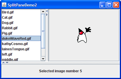
If the top portion of the split pane looks familiar to you, it is because the program puts the split pane created by 如果拆分窗格的顶部看起来很熟悉,这是因为程序将SplitPaneDemo inside a second split pane. SplitPaneDemo创建的拆分窗格放在第二个拆分窗格中。A simple 简单的JLabel is the other component in the second split pane. JLabel是第二个拆分窗格中的另一个组件。This is not the most practical use of a nested split pane, but it gets the point across.这不是嵌套拆分窗格的最实际的用法,但它能让人明白这一点。
Click the Launch button to run the SplitPaneDemo2 using Java™ Web Start (download JDK 7 or later).单击启动按钮,使用Java™Web启动运行SplitPaneDemo2(下载JDK 7或更高版本)。Alternatively, to compile and run the example yourself, consult the example index.或者,要自己编译和运行示例,请参考示例索引。
Here's the interesting part of the code, which you can find in 下面是代码的有趣部分,您可以在SplitPaneDemo2.java:SplitPaneDemo2.java中找到:
//Create an instance of SplitPaneDemo
SplitPaneDemo splitPaneDemo = new SplitPaneDemo();
JSplitPane top = splitPaneDemo.getSplitPane();

...
//Create a regular old label
label = new JLabel("Click on an image name in the list.",
                   JLabel.CENTER);

//Create a split pane and put "top" (a split pane)
//and JLabel instance in it.
JSplitPane splitPane = new JSplitPane(JSplitPane.VERTICAL_SPLIT,
                                      top, label);
Refer to Solving Common Component Problems for information about fixing a border problem that can appear when nesting split panes.有关修复嵌套拆分窗格时可能出现的边界问题的信息,请参阅解决常见组件问题。
The Split Pane API拆分窗格API
The following tables list the commonly used 下表列出了常用的JSplitPane constructors and methods. JSplitPane构造函数和方法。Other methods you are most likely to invoke on a 您最可能在JSplitPane object are those such as setPreferredSize that its superclasses provide. JSplitPane对象上调用的其他方法是其超类提供的setPreferredSize。See The JComponent API for tables of commonly used inherited methods.有关常用继承方法的表,请参阅JComponent API。
The API for using lists falls into these categories:使用列表的API分为以下几类:
Setting up the Split Pane设置拆分窗格Managing the Split Pane's Contents管理拆分窗格的内容Positioning the Divider定位分隔器
JSplitPane()JSplitPane(int)JSplitPane(int, boolean)JSplitPane(int, Component, Component)JSplitPane(int, boolean, Component, Component) |
int parameter indicates the split pane's orientation, either HORIZONTAL_SPLIT (the default) or VERTICAL_SPLIT. int参数表示拆分窗格的方向,即HORIZONTAL_SPLIT(默认)或VERTICAL_SPLIT。boolean parameter, when present, sets whether the components continually repaint as the user drags the split pane. boolean参数(如果存在)设置当用户拖动拆分窗格时组件是否持续重新绘制。Component parameters set the initial left and right, or top and bottom components, respectively.Component参数分别设置初始的左组件和右组件,或顶部组件和底部组件。 |
void setOrientation(int)int getOrientation() |
HORIZONTAL_SPLIT or VERTICAL_SPLIT defined in JSplitPane. JSplitPane中定义的HORIZONTAL_SPLIT或VERTICAL_SPLIT。 |
void setDividerSize(int)int getDividerSize() |
|
void setContinuousLayout(boolean)boolean isContinuousLayout() |
|
void setOneTouchExpandable(boolean)boolean isOneTouchExpandable() |
void setTopComponent(Component)void setBottomComponent(Component)void setLeftComponent(Component)void setRightComponent(Component)Component getTopComponent()Component getBottomComponent()Component getLeftComponent()Component getRightComponent() |
|
void remove(Component)void removeAll() |
|
void add(Component) |
void setDividerLocation(double)void setDividerLocation(int)int getDividerLocation() |
double) or a pixel location (int).double)或像素位置(int)。 |
void resetToPreferredSizes() |
|
void setLastDividerLocation(int)int getLastDividerLocation() |
|
int getMaximumDividerLocation()int getMinimumDividerLocation() |
|
void setResizeWeight(float)float getResizeWeight() |
Examples that Use Split Panes使用拆分窗格的示例
This table shows some examples that use 下表显示了一些使用JSplitPane and where those examples are described.JSplitPane的示例,以及这些示例的描述位置。
SplitPaneDemo |
||
SplitPaneDividerDemo |
||
SplitPaneDemo2 |
||
TreeDemo |
||
TextComponentDemo |
||
TextSamplerDemo |
GridLayout and BorderLayout are used, along with the split pane's resize weight, to ensure that the components in scroll panes share all extra space.GridLayout和BorderLayout)以及拆分窗格的调整大小权重,以确保滚动窗格中的组件共享所有额外空间。 | |
ListSelectionDemo |