Lesson: Using Swing Components
Section: How to Use Various Components
The Java Tutorials have been written for JDK 8.Java教程是为JDK 8编写的。Examples and practices described in this page don't take advantage of improvements introduced in later releases and might use technology no longer available.本页中描述的示例和实践没有利用后续版本中引入的改进,并且可能使用不再可用的技术。See Java Language Changes for a summary of updated language features in Java SE 9 and subsequent releases.有关Java SE 9及其后续版本中更新的语言特性的摘要,请参阅Java语言更改。
See JDK Release Notes for information about new features, enhancements, and removed or deprecated options for all JDK releases.有关所有JDK版本的新功能、增强功能以及已删除或不推荐的选项的信息,请参阅JDK发行说明。
How to Use Tabbed Panes如何使用选项卡式窗格
With the 使用JTabbedPane class, you can have several components, such as panels, share the same space. JTabbedPane类,可以让多个组件(如面板)共享相同的空间。The user chooses which component to view by selecting the tab corresponding to the desired component. 用户通过选择与所需组件相对应的选项卡来选择要查看的组件。If you want similar functionality without the tab interface, you can use a card layout instead of a tabbed pane.如果您想要类似的功能而不需要选项卡界面,可以使用卡片布局而不是选项卡式窗格。
To Create Tabbed Panes创建选项卡式窗格的步骤
To create a tabbed pane, instantiate 要创建选项卡式窗格,请实例化JTabbedPane, create the components you wish it to display, and then add the components to the tabbed pane using the addTab method.JTabbedPane,创建希望它显示的组件,然后使用addTab方法将组件添加到选项卡式窗格。
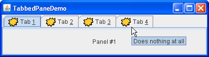
The following picture introduces an application called 下图介绍了一个名为TabbedPaneDemo that has a tabbed pane with four tabs.TabbedPaneDemo的应用程序,它有一个带有四个选项卡的选项卡式窗格。
Try this:
Click the Launch button to run TabbedPaneDemo using Java™ Web Start (download JDK 7 or later).单击启动按钮,使用Java™Web启动运行TabbedPaneDemo(下载JDK 7或更高版本)。Alternatively, to compile and run the example yourself, consult the example index.或者,要自己编译和运行示例,请参考示例索引。
Put the cursor over a tab.将光标放在选项卡上。
The tool tip associated with the tab appears.将显示与选项卡关联的工具提示。As a convenience, you can specify tool tip text when you add a component to the tabbed pane.为方便起见,可以在将组件添加到选项卡式窗格时指定工具提示文本。Select a tab by clicking it.通过单击选项卡来选择选项卡。
The tabbed pane displays the component corresponding to the tab.选项卡式窗格显示与选项卡对应的组件。Select a tab by entering its mnemonic.通过输入选项卡的助记符来选择选项卡。
For example, in the Java look and feel you can select the tab labeled "Tab 3" by typing Alt-3.例如,在Java外观中,您可以通过键入Alt-3来选择标记为“Tab3”的选项卡。Navigate between scrollable tabs.在可滚动选项卡之间导航。
This example provides scrollable tabs.此示例提供了可滚动的选项卡。Resize the dialog box by moving its left or right boundary so that tabs do not fit within the dialog.通过移动对话框的左边界或右边界调整对话框的大小,使选项卡不适合对话框。Scroll arrows appear next to the tabs.滚动箭头出现在选项卡旁边。
Click the arrow to view one of the hidden tabs.单击箭头可查看其中一个隐藏选项卡。
Note that clicking the arrow only reveals hidden tabs.请注意,单击箭头仅显示隐藏的选项卡。It does not select a new tab.它不选择新选项卡。
As the 如TabbedPaneDemo example shows, a tab can have a tool tip and a mnemonic, and it can display both text and an image.TabbedPaneDemo示例所示,选项卡可以具有工具提示和助记符,并且可以显示文本和图像。
Tab Placement标签放置
The default tab placement is set to the 默认选项卡放置设置为TOP location, as shown above. TOP位置,如上所示。You can change the tab placement to 可以使用LEFT, RIGHT, TOP or BOTTOM by using the setTabPlacement method.setTabPlacement方法将选项卡放置更改为LEFT、RIGHT、TOP或BOTTOM。
Code for Tabbed Panes选项卡式窗格的代码
The following code from TabbedPaneDemo.java creates the tabbed pane in the previous example. TabbedPaneDemo.java中的以下代码在前面的示例中创建了选项卡式窗格。Note that no event-handling code is necessary. 请注意,不需要事件处理代码。The JTabbedPane object takes care of mouse and keyboard events for you.JTabbedPane对象为您处理鼠标和键盘事件。
JTabbedPane tabbedPane = new JTabbedPane();
ImageIcon icon = createImageIcon("images/middle.gif");

JComponent panel1 = makeTextPanel("Panel #1");
tabbedPane.addTab("Tab 1", icon, panel1,
                  "Does nothing");
tabbedPane.setMnemonicAt(0, KeyEvent.VK_1);

JComponent panel2 = makeTextPanel("Panel #2");
tabbedPane.addTab("Tab 2", icon, panel2,
                  "Does twice as much nothing");
tabbedPane.setMnemonicAt(1, KeyEvent.VK_2);

JComponent panel3 = makeTextPanel("Panel #3");
tabbedPane.addTab("Tab 3", icon, panel3,
                  "Still does nothing");
tabbedPane.setMnemonicAt(2, KeyEvent.VK_3);

JComponent panel4 = makeTextPanel(
        "Panel #4 (has a preferred size of 410 x 50).");
panel4.setPreferredSize(new Dimension(410, 50));
tabbedPane.addTab("Tab 4", icon, panel4,
                      "Does nothing at all");
tabbedPane.setMnemonicAt(3, KeyEvent.VK_4);
As the previous code shows, the 正如前面的代码所示,addTab method handles the bulk of the work in setting up a tab in a tabbed pane. addTab方法处理了在选项卡式窗格中设置选项卡的大部分工作。The addTab方法有几种形式,但它们都使用字符串标题和选项卡显示的组件。addTab method has several forms, but they all use both a string title and the component to be displayed by the tab. Optionally, you can specify an icon and tool tip string. 或者,可以指定图标和工具提示字符串。The text or icon (or both) can be null. 文本或图标(或两者)可以为空。Another way to create a tab is to use the 创建选项卡的另一种方法是使用insertTab method, which lets you specify the index of the tab you're adding. insertTab方法,该方法允许您指定要添加的选项卡的索引。Note that the 注意,addTab method does not allow index specification in this step.addTab方法不允许在此步骤中指定索引。
To Switch to Specific Tabs切换到特定选项卡
There are three ways to switch to specific tabs using GUI.使用GUI切换到特定选项卡有三种方法。
Using a mouse.使用鼠标。To switch to a specific tab, the user clicks it with the mouse.要切换到特定选项卡,用户用鼠标单击它。Using keyboard arrows.使用键盘箭头。When the当JTabbedPaneobject has the focus, the keyboard arrows can be used to switch from tab to tab.JTabbedPane对象具有焦点时,可以使用键盘箭头在选项卡之间切换。Using key mnemonics.使用键助记符。ThesetMnemonicAtmethod allows the user to switch to a specific tab using the keyboard.setMnemonicAt方法允许用户使用键盘切换到特定选项卡。For example,例如,setMnemonicAt(3, KeyEvent.VK_4)makes '4' the mnemonic for the fourth tab (which is at index 3, since the indices start with 0); pressing Alt-4 makes the fourth tab's component appear.setMnemonicAt(3, KeyEvent.VK_4)使“4”成为第四个选项卡的助记符(即索引3处,因为索引从0开始);按Alt-4将显示第四个选项卡的组件。Often, a mnemonic uses a character in the tab's title that is then automatically underlined.通常,助记符在标签标题中使用一个字符,然后自动加下划线。
To switch to a specific tab programmatically, use the 要以编程方式切换到特定选项卡,请使用setSelectedIndex or the setSelectedComponent methods.setSelectedIndex方法或setSelectedComponent组件方法。
Preferred Size in Tabs标签中的首选大小
When building components to add to a tabbed pane, keep in mind that no matter which child of a tabbed pane is visible, each child gets the same amount of space in which to display itself. 在构建要添加到选项卡式窗格的组件时,请记住,无论选项卡式窗格中的哪个子项可见,每个子项都会获得相同的空间量来显示自己。The preferred size of the tabbed pane is just big enough to display its tallest child at its preferred height, and its widest child at its preferred width. 选项卡式窗格的首选大小刚好足以在其首选高度显示其最高子级,并在其首选宽度显示其最宽子级。Similarly, the minimum size of the tabbed pane depends on the biggest minimum width and height of all its children.类似地,选项卡式窗格的最小大小取决于其所有子项的最大最小宽度和高度。
In the 在TabbedPaneDemo example, the fourth panel has a preferred width and height that are larger than those of the other panels. TabbedPaneDemo示例中,第四个面板的首选宽度和高度大于其他面板的宽度和高度。Thus, the preferred size of the tabbed pane is just big enough to display the fourth panel at its preferred size. 因此,选项卡式窗格的首选大小刚好足以以其首选大小显示第四个面板。Every panel gets exactly the same amount of space — 410 pixels wide and 50 high, assuming the tabbed pane is at its preferred size. 每个面板获得完全相同的空间量;410像素宽和50像素高,假设选项卡式窗格处于其优选大小。If you do not understand how preferred size is used, please refer to How Layout Management Works.如果您不了解如何使用首选尺寸,请参阅布局管理的工作原理。
Tabs With Custom Components带有自定义组件的选项卡
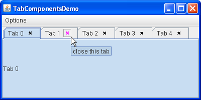
The TabComponentsDemo example introduces a tabbed pane whose tabs contain real components. TabComponentsDemo示例引入了一个选项卡式窗格,其选项卡包含实际组件。The use of custom components brings new features such as buttons, combo boxes, labels and other components to tabs, and allows more complex user interaction.自定义组件的使用为选项卡带来了新功能,如按钮、组合框、标签和其他组件,并允许更复杂的用户交互。
Here is a tabbed pane with close buttons on its tabs.这是一个选项卡式窗格,其选项卡上有关闭按钮。
Try this:
Click the Launch button to run TabComponentsDemo using Java™ Web Start (download JDK 7 or later).单击启动按钮,使用Java™Web启动运行TabComponentsDemo(下载JDK 7或更高版本)。Alternatively, to compile and run the example yourself, consult the example index.或者,要自己编译和运行示例,请参考示例索引。Put the cursor over a tab.将光标放在选项卡上。Select a tab by clicking it (make sure not to hit the little cross).通过单击选项卡来选择选项卡(确保不要碰到小十字)。Put the cursor over one of the widgets with a little cross.将光标放在其中一个带有小十字的小部件上。
The cross turns magenta and gets enclosed in a square.十字架变成了洋红,并被包围在一个正方形中。A tool tip associated with the close button appears.将出现与关闭按钮关联的工具提示。
Click the cross with the left mouse button to close the tab.用鼠标左键单击十字以关闭选项卡。Restore the tabs that have been removed by choosing the Reset JTabbedPane item from the Options menu.通过从“选项”菜单中选择“重置JTabbedPane”项,恢复已删除的选项卡。Note that tabs with custom components are displayed on top of original tabbed pane tabs.请注意,带有自定义组件的选项卡显示在原始选项卡窗格选项卡的顶部。
To view the tabs underneath, open the Options menu and clear the Use TabComponents check box.要查看下面的选项卡,请打开“选项”菜单并清除“使用选项卡组件”复选框。Display the tabs with components by selecting the Use TabComponents check box again.再次选中“使用选项卡组件”复选框,显示带有组件的选项卡。Close all tabs. Now the tabbed pane is empty.关闭所有选项卡。现在选项卡窗格为空。
To Remove Tabs要删除选项卡:
The following code from ButtonTabComponent.java removes a tab from the tabbed pane. ButtonTabComponent.java中的以下代码从选项卡窗格中删除了一个选项卡。Note that event-handling code is necessary. 请注意,事件处理代码是必需的。Since each tab contains a real 由于每个选项卡都包含一个真实的JButton object, you must attach an ActionListener to the close button. JButton对象,因此必须将ActionListener附加到关闭按钮。As the user clicks the button, the 当用户单击按钮时,actionPerformed method determines the index of the tab it belongs to and removes the corresponding tab.actionPerformed方法确定其所属选项卡的索引,并删除相应的选项卡。
public void actionPerformed(ActionEvent e) {
int i = pane.indexOfTabComponent(ButtonTabComponent.this);
    if (i != -1) {
    pane.remove(i);
    }
}
To Give Titles to Customized Tabs为自定义选项卡提供标题
The code below, taken from 下面的代码取自ButtonTabComponent.java, shows how a customized tab component gets a title from an original tabbed pane tab.ButtonTabComponent.java,显示了自定义选项卡组件如何从原始选项卡窗格选项卡获取标题。
JLabel label = new JLabel(title) {
    public String getText() {
        int i = pane.indexOfTabComponent(ButtonTabComponent.this);
        if (i != -1) {
            return pane.getTitleAt(i);
        }
        return null;
    }
};
The Tabbed Pane API选项卡式窗格API
The following tables list the commonly used 下表列出了常用的JTabbedPane constructors and methods. JTabbedPane构造函数和方法。The API for using tabbed panes falls into the following categories:使用选项卡式窗格的API分为以下几类:
Creating and Setting Up a Tabbed Pane创建和设置选项卡式窗格Inserting, Removing, Finding, and Selecting Tabs插入、删除、查找和选择选项卡Changing Tab Appearance更改选项卡外观Setting Up Custom Components on Tabs在选项卡上设置自定义组件
JTabbedPane()JTabbedPane(int)JTabbedPane(int, int) |
SwingConstants interface, which JTabbedPane implements): TOP, BOTTOM, LEFT, RIGHT. SwingConstants接口中定义,JTabbedPane实现了该接口):TOP、BOTTOM、LEFT和RIGHT。JTabbedPane): WRAP_TAB_LAYOUT or SCROLL_TAB_LAYOUT.JTabbedPane中定义):WRAP_TAB_LAYOUT或SCROLL_TAB_LAYOUT。 |
addTab(String, Icon, Component, String)addTab(String, Icon, Component)addTab(String, Component) |
|
void setTabLayoutPolicy(int)int getTabLayoutPolicy() |
WRAP_TAB_LAYOUT and SCROLL_TAB_LAYOUT. WRAP_TAB_LAYOUT和SCROLL_TAD_LAY。WRAP_TAB_LAYOUT.WRAP_TAB_LAYOUT。 |
void setTabPlacement(int)int getTabPlacement() |
SwingConstants, which is implemented by JTabbedPane) are TOP, BOTTOM, LEFT, and RIGHT.SwingConstants中定义,由JTabbedPane实现)为TOP、BOTTOM、LEFT和RIGHT。 |
insertTab(String, Icon, Component, String, int) |
addTab.addTab的参数相同。 |
remove(Component)removeTabAt(int) |
|
removeAll() |
|
int indexOfComponent(Component)int indexOfTab(String)int indexOfTab(Icon) |
|
void setSelectedIndex(int)void setSelectedComponent(Component) |
|
int getSelectedIndex()Component getSelectedComponent() |
void setComponentAt(int, Component)Component getComponentAt(int) |
|
void setTitleAt(int, String)String getTitleAt(int) |
|
void setIconAt(int, Icon)Icon getIconAt(int)void setDisabledIconAt(int, Icon)Icon getDisabledIconAt(int) |
|
void setBackgroundAt(int, Color)Color getBackgroundAt(int)void setForegroundAt(int, Color)Color getForegroundAt(int) |
setForegroundAt.setForegroundAt为其指定其他颜色的选项卡除外。 |
void setEnabledAt(int, boolean)boolean isEnabledAt(int) |
|
void setMnemonicAt(int, int)int getMnemonicAt(int) |
|
void setDisplayedMnemonicIndexAt(int, int)int getDisplayedMnemonicIndexAt(int) |
|
void setToolTipTextAt(int, String)String getToolTipTextAt(int) |
void setTabComponentAt(int, Component) |
JTabbedPane renders the title or icon. The same component cannot be used for several tabs.JTabbedPane呈现标题或图标。同一组件不能用于多个选项卡。 |
Component getTabComponentAt(int) |
|
int indexOfTabComponent(Component) |
Examples That Use Tabbed Panes使用选项卡式窗格的示例
This table lists examples that use 下表列出了使用JTabbedPane and points to where those examples are described.JTabbedPane的示例,并指出了这些示例的描述位置。
TabbedPaneDemo |
||
TabComponentsDemo |
||
BoxAlignmentDemo |
JTabbedPane as the only child of a frame's content pane.JTabbedPane作为框架内容窗格的唯一子级。 | |
BorderDemo |
BoxAlignmentDemo.BoxAlignmentDemo的方式使用其选项卡式窗格。 | |
DialogDemo |