Lesson: Using Swing Components
Section: How to Use Various Components
The Java Tutorials have been written for JDK 8.Java教程是为JDK 8编写的。Examples and practices described in this page don't take advantage of improvements introduced in later releases and might use technology no longer available.本页中描述的示例和实践没有利用后续版本中引入的改进,并且可能使用不再可用的技术。See Java Language Changes for a summary of updated language features in Java SE 9 and subsequent releases.有关Java SE 9及其后续版本中更新的语言特性的摘要,请参阅Java语言更改。
See JDK Release Notes for information about new features, enhancements, and removed or deprecated options for all JDK releases.有关所有JDK版本的新功能、增强功能以及已删除或不推荐的选项的信息,请参阅JDK发行说明。
How to Use Buttons, Check Boxes, and Radio Buttons如何使用按钮、复选框和单选按钮
To create a button, you can instantiate one of the many classes that descend from the 要创建按钮,可以实例化从AbstractButton class. AbstractButton类派生的许多类之一。The following table shows the Swing-defined 下表显示了您可能希望使用的Swing定义的AbstractButton subclasses that you might want to use:AbstractButton子类:
JButton |
||
JCheckBox |
||
JRadioButton |
||
JMenuItem |
||
JCheckBoxMenuItem |
||
JRadioButtonMenuItem |
||
JToggleButton |
JCheckBox and JRadioButton. JCheckBox和JRadioButton继承的切换功能。 |
Note:
First, this section explains the basic button API that 首先,本节解释AbstractButton defines — and thus all Swing buttons have in common. AbstractButton定义的基本按钮API;因此所有摆动按钮具有共同点。Next, it describes the small amount of API that 接下来,它描述了JButton adds to AbstractButton. JButton添加到AbstractButton的少量API。After that, this section shows you how to use specialized API to implement check boxes and radio buttons.之后,本节将向您展示如何使用专门的API来实现复选框和单选按钮。
How to Use the Common Button API如何使用公共按钮API
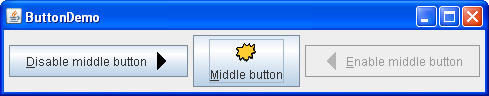
Here is a picture of an application that displays three buttons:下面是显示三个按钮的应用程序的图片:
Click the Launch button to run the Button Demo using Java™ Web Start (download JDK 7 or later).单击启动按钮,使用Java™Web启动运行按钮演示(下载JDK 7或更高版本)。Alternatively, to compile and run the example yourself, consult the example index.或者,要自己编译和运行示例,请参考示例索引。
Click the left button.单击左侧按钮。
It disables the middle button (and itself, since it is no longer useful) and enables the right button.它禁用中间按钮(以及它本身,因为它不再有用),并启用右按钮。Click the right button.单击右键。
It enables the middle button and the left button, and disables itself.它启用中间按钮和左按钮,并禁用自身。
As the 如ButtonDemo example shows, a Swing button can display both text and an image. ButtonDemo示例所示,Swing按钮可以同时显示文本和图像。In 在ButtonDemo, each button has its text in a different place, relative to its image. ButtonDemo中,每个按钮的文本相对于其图像位于不同的位置。The underlined letter in each button's text shows the mnemonic — the keyboard alternative — for each button. 每个按钮文本中带下划线的字母显示助记符—键盘替代—对于每个按钮。In most look and feels, the user can click a button by pressing the Alt key and the mnemonic. 在大多数外观中,用户可以通过按Alt键和助记符来单击按钮。For example, Alt-M would click the Middle button in ButtonDemo.例如,Alt-M将单击ButtonDemo中的中间按钮。
When a button is disabled, the look and feel automatically generates the button's disabled appearance. 禁用按钮时,外观将自动生成按钮的禁用外观。However, you could provide an image to be substituted for the normal image. 但是,您可以提供一个图像来替代正常图像。For example, you could provide gray versions of the images used in the left and right buttons.例如,您可以提供左右按钮中使用的图像的灰色版本。
How you implement event handling depends on the type of button you use and how you use it. 如何实现事件处理取决于使用的按钮类型和使用方式。Generally, you implement an action listener, which is notified every time the user clicks the button. 通常,您实现了一个动作监听器,每次用户单击按钮时都会收到通知。For check boxes you usually use an item listener, which is notified when the check box is selected or deselected.对于复选框,您通常使用项目侦听器,当选中或取消选中复选框时,会通知该侦听器。
Below is the code from 下面是ButtonDemo.java that creates the buttons in the previous example and reacts to button clicks. ButtonDemo.java中的代码,它在前面的示例中创建按钮并对按钮单击做出反应。The bold code is the code that would remain if the buttons had no images.粗体代码是在按钮没有图像时保留的代码。
//In initialization code:
    ImageIcon leftButtonIcon = createImageIcon("images/right.gif");
    ImageIcon middleButtonIcon = createImageIcon("images/middle.gif");
    ImageIcon rightButtonIcon = createImageIcon("images/left.gif");
b1 = new JButton("Disable middle button", leftButtonIcon);
    b1.setVerticalTextPosition(AbstractButton.CENTER);
    b1.setHorizontalTextPosition(AbstractButton.LEADING); //aka LEFT, for left-to-right locales
b1.setMnemonic(KeyEvent.VK_D);
b1.setActionCommand("disable");
b2 = new JButton("Middle button", middleButtonIcon);
    b2.setVerticalTextPosition(AbstractButton.BOTTOM);
    b2.setHorizontalTextPosition(AbstractButton.CENTER);
b2.setMnemonic(KeyEvent.VK_M);
b3 = new JButton("Enable middle button", rightButtonIcon);
    //Use the default text position of CENTER, TRAILING (RIGHT).
b3.setMnemonic(KeyEvent.VK_E);
    b3.setActionCommand("enable");
    b3.setEnabled(false);

    //Listen for actions on buttons 1 and 3.
b1.addActionListener(this);
    b3.addActionListener(this);

    b1.setToolTipText("Click this button to disable "
                      + "the middle button.");
    b2.setToolTipText("This middle button does nothing "
                      + "when you click it.");
    b3.setToolTipText("Click this button to enable the "
                      + "middle button.");
    ...
}
public void actionPerformed(ActionEvent e) {
    if ("disable".equals(e.getActionCommand())) {
        b2.setEnabled(false);
        b1.setEnabled(false);
        b3.setEnabled(true);
    } else {
        b2.setEnabled(true);
        b1.setEnabled(true);
        b3.setEnabled(false);
    }
}

protected static ImageIcon createImageIcon(String path) {
    java.net.URL imgURL = ButtonDemo.class.getResource(path);
    ...//error handling omitted for clarity...
    return new ImageIcon(imgURL);
}
How to Use JButton Features如何使用JButton功能
Ordinary buttons — 普通按钮—JButton objects — have just a bit more functionality than the AbstractButton class provides: You can make a JButton be the default button.JButton对象—比AbstractButton类提供的功能多一点:您可以将JButton设置为默认按钮。
At most one button in a top-level container can be the default button. 顶级容器中最多有一个按钮可以是默认按钮。The default button typically has a highlighted appearance and acts clicked whenever the top-level container has the keyboard focus and the user presses the Return or Enter key. 默认按钮通常具有突出显示的外观,每当顶级容器具有键盘焦点并且用户按下回车键或回车键时,默认按钮就会被单击。Here is a picture of a dialog, implemented in the ListDialog example, in which the Set button is the default button:下面是在ListDialog示例中实现的对话框的图片,其中设置按钮是默认按钮:
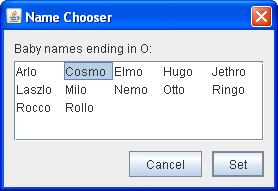
You set the default button by invoking the 通过在顶级容器的根窗格上调用setDefaultButton method on a top-level container's root pane. setDefaultButton方法来设置默认按钮。Here is the code that sets up the default button for the 下面是为ListDialog example:ListDialog示例设置默认按钮的代码:
//In the constructor for a JDialog subclass:
getRootPane().setDefaultButton(setButton);
The exact implementation of the default button feature depends on the look and feel. 默认按钮功能的确切实现取决于外观。For example, in the Windows look and feel, the default button changes to whichever button has the focus, so that pressing Enter clicks the focused button. 例如,在Windows look and feel中,默认按钮更改为具有焦点的按钮,因此按Enter键可单击焦点按钮。When no button has the focus, the button you originally specified as the default button becomes the default button again.当没有按钮具有焦点时,最初指定为默认按钮的按钮将再次成为默认按钮。
How to Use Check Boxes如何使用复选框
The JCheckBox class provides support for check box buttons. JCheckBox类提供对复选框按钮的支持。You can also put check boxes in menus, using the 您还可以使用JCheckBoxMenuItem class. JCheckBoxMenuItem类在菜单中放置复选框。Because 因为JCheckBox and JCheckBoxMenuItem inherit from AbstractButton, Swing check boxes have all the usual button characteristics, as discussed earlier in this section. JCheckBox和JCheckBoxMenuItem继承自AbstractButton,所以Swing复选框具有所有常见的按钮特性,如本节前面讨论的。For example, you can specify images to be used in check boxes.例如,可以指定要在复选框中使用的图像。
Check boxes are similar to radio buttons but their selection model is different, by convention. 复选框类似于单选按钮,但按照惯例,它们的选择模式不同。Any number of check boxes in a group — none, some, or all — can be selected. 组中的任意数量的复选框—无、部分或全部—可以选择。A group of radio buttons, on the other hand, can have only one button selected.另一方面,一组单选按钮只能选择一个按钮。
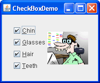
Here is a picture of an application that uses four check boxes to customize a cartoon:以下是使用四个复选框自定义卡通的应用程序的图片:
Click the Launch button to run the CheckBox Demo using Java™ Web Start (download JDK 7 or later).单击启动按钮,使用Java™Web启动运行复选框演示(下载JDK 7或更高版本)。Alternatively, to compile and run the example yourself, consult the example index.或者,要自己编译和运行示例,请参考示例索引。
Click the Chin button or press Alt-c.单击Chin按钮或按Alt-c。
The Chin check box becomes unselected, and the chin disappears from the picture.Chin复选框变为未选中状态,下巴将从图片中消失。The other check boxes remain selected.其他复选框保持选中状态。This application has one item listener that listens to all the check boxes.此应用程序有一个侦听所有复选框的项侦听器。Each time the item listener receives an event, the application loads a new picture that reflects the current state of the check boxes.每次项目侦听器接收到事件时,应用程序都会加载反映复选框当前状态的新图片。
A check box generates one item event and one action event per click. 复选框每次单击生成一个项目事件和一个操作事件。Usually, you listen only for item events, since they let you determine whether the click selected or deselected the check box. 通常,您只侦听项目事件,因为它们允许您确定单击是选中还是取消选中复选框。Below is the code from 下面是CheckBoxDemo.java that creates the check boxes in the previous example and reacts to clicks.CheckBoxDemo.java中的代码,用于创建上一个示例中的复选框并对单击做出反应。
//In initialization code:
    chinButton = new JCheckBox("Chin");
    chinButton.setMnemonic(KeyEvent.VK_C);
    chinButton.setSelected(true);

    glassesButton = new JCheckBox("Glasses");
    glassesButton.setMnemonic(KeyEvent.VK_G);
    glassesButton.setSelected(true);

    hairButton = new JCheckBox("Hair");
    hairButton.setMnemonic(KeyEvent.VK_H);
    hairButton.setSelected(true);

    teethButton = new JCheckBox("Teeth");
    teethButton.setMnemonic(KeyEvent.VK_T);
    teethButton.setSelected(true);

    //Register a listener for the check boxes.
    chinButton.addItemListener(this);
    glassesButton.addItemListener(this);
    hairButton.addItemListener(this);
    teethButton.addItemListener(this);
...
public void itemStateChanged(ItemEvent e) {
    ...
    Object source = e.getItemSelectable();

    if (source == chinButton) {
        //...make a note of it...
    } else if (source == glassesButton) {
        //...make a note of it...
    } else if (source == hairButton) {
        //...make a note of it...
    } else if (source == teethButton) {
        //...make a note of it...
    }

    if (e.getStateChange() == ItemEvent.DESELECTED)
        //...make a note of it...
    ...
    updatePicture();
}
How to Use Radio Buttons如何使用单选按钮
Radio buttons are groups of buttons in which, by convention, only one button at a time can be selected. 单选按钮是一组按钮,按照惯例,一次只能选择一个按钮。The Swing release supports radio buttons with the Swing版本支持带有JRadioButton and ButtonGroup classes. JRadioButton和ButtonGroup类的单选按钮。To put a radio button in a menu, use the 要在菜单中放置单选按钮,请使JRadioButtonMenuItem class. JRadioButtonMenuItem类。Other ways of displaying one-of-many choices are combo boxes and lists. 显示许多选项之一的其他方式是组合框和列表。Radio buttons look similar to check boxes, but, by convention, check boxes place no limits on how many items can be selected at a time.单选按钮看起来类似于复选框,但按照惯例,复选框对一次可以选择的项目数量没有限制。
Because 由于JRadioButton inherits from AbstractButton, Swing radio buttons have all the usual button characteristics, as discussed earlier in this section. JRadioButton继承自AbstractButton,Swing单选按钮具有所有常见的按钮特性,如本节前面所述。For example, you can specify the image displayed in a radio button.例如,可以指定单选按钮中显示的图像。
Here is a picture of an application that uses five radio buttons to let you choose which kind of pet is displayed:下面是一个应用程序的图片,它使用五个单选按钮让您选择显示哪种宠物:

Click the Launch button to run the RadioButton Demo using Java™ Web Start (download JDK 7 or later).单击启动按钮,使用Java™Web启动运行RadioButton演示(下载JDK 7或更高版本)。Alternatively, to compile and run the example yourself, consult the example index.或者,要自己编译和运行示例,请参考示例索引。
Click the Dog button or press Alt-d.单击Dog按钮或按Alt-d。
The Dog button becomes selected, which makes the Bird button become unselected.Dog按钮变为选中状态,这将使Bird按钮变为未选中状态。The picture switches from a bird to a dog.这幅画从鸟变成了狗。This application has one action listener that listens to all the radio buttons.此应用程序有一个操作侦听器,用于侦听所有单选按钮。Each time the action listener receives an event, the application displays the picture for the radio button that was just clicked.每次动作侦听器接收到事件时,应用程序都会显示刚刚单击的单选按钮的图片。
Each time the user clicks a radio button (even if it was already selected), the button fires an action event. 每次用户单击单选按钮(即使它已被选中),该按钮都会触发一个动作事件。One or two item events also occur — one from the button that was just selected, and another from the button that lost the selection (if any). 还发生一个或两个项目事件;一个来自刚刚选择的按钮,另一个来自丢失选择的按钮(如果有)。Usually, you handle radio button clicks using an action listener.通常,您使用操作侦听器处理单选按钮单击。
Below is the code from 下面是RadioButtonDemo.java that creates the radio buttons in the previous example and reacts to clicks.RadioButtonDemo.java中的代码,该代码在前面的示例中创建单选按钮并对单击做出反应。
//In initialization code:
    //Create the radio buttons.
    JRadioButton birdButton = new JRadioButton(birdString);
    birdButton.setMnemonic(KeyEvent.VK_B);
    birdButton.setActionCommand(birdString);
    birdButton.setSelected(true);

    JRadioButton catButton = new JRadioButton(catString);
    catButton.setMnemonic(KeyEvent.VK_C);
    catButton.setActionCommand(catString);

    JRadioButton dogButton = new JRadioButton(dogString);
    dogButton.setMnemonic(KeyEvent.VK_D);
    dogButton.setActionCommand(dogString);

    JRadioButton rabbitButton = new JRadioButton(rabbitString);
    rabbitButton.setMnemonic(KeyEvent.VK_R);
    rabbitButton.setActionCommand(rabbitString);

    JRadioButton pigButton = new JRadioButton(pigString);
    pigButton.setMnemonic(KeyEvent.VK_P);
    pigButton.setActionCommand(pigString);

    //Group the radio buttons.
    ButtonGroup group = new ButtonGroup();
    group.add(birdButton);
    group.add(catButton);
    group.add(dogButton);
    group.add(rabbitButton);
    group.add(pigButton);

    //Register a listener for the radio buttons.
    birdButton.addActionListener(this);
    catButton.addActionListener(this);
    dogButton.addActionListener(this);
    rabbitButton.addActionListener(this);
    pigButton.addActionListener(this);
...
public void actionPerformed(ActionEvent e) {
    picture.setIcon(new ImageIcon("images/"
                                  + e.getActionCommand()
                                  + ".gif"));
}
For each group of radio buttons, you need to create a 对于每组单选按钮,您需要创建一个ButtonGroup instance and add each radio button to it. ButtongGroup实例并将每个单选按钮添加到其中。The 当用户选择组中的另一个按钮时,ButtonGroup takes care of deselecting the previously selected button when the user selects another button in the group.ButtonGroup负责取消选择先前选择的按钮。
You should generally initialize a group of radio buttons so that one is selected. 通常应初始化一组单选按钮,以便选择一个。However, the API doesn't enforce this rule — a group of radio buttons can have no initial selection. Once the user has made a selection, exactly one button is selected from then on.然而,API不强制执行该规则—一组单选按钮可以没有初始选择。一旦用户做出选择,从那时起只选择一个按钮。
The Button API按钮API
The following tables list the commonly used button-related API. 下表列出了常用的按钮相关API。Other methods you might call, such as 您可能调用的其他方法,如setFont and setForeground, are listed in the API tables in The JComponent Class.setFont和setForeground,在JComponent类的API表中列出。
The API for using buttons falls into these categories:使用按钮的API分为以下几类:
Setting or Getting the Button's Contents设置或获取按钮的内容Fine Tuning the Button's Appearance微调按钮的外观Implementing the Button's Functionality实现按钮的功能Check Box Constructors复选框构造函数Radio Button Constructors单选按钮构造函数Toggle Button Constructors切换按钮构造函数Commonly Used Button Group Constructors/Methods常用按钮组构造函数/方法
JButton(Action)JButton(String, Icon)JButton(String)JButton(Icon)JButton() |
JButton instance, initializing it to have the specified text/image/action.JButton实例,将其初始化为具有指定的text/image/action。 |
void setAction(Action)Action getAction() |
Action instance.Action实例的值设置或获取按钮的属性。 |
void setText(String)String getText() |
|
void setIcon(Icon)Icon getIcon() |
|
void setDisabledIcon(Icon)Icon getDisabledIcon() |
|
void setPressedIcon(Icon)Icon getPressedIcon() |
|
void setSelectedIcon(Icon)Icon getSelectedIcon()void setDisabledSelectedIcon(Icon)Icon getDisabledSelectedIcon() |
|
setRolloverEnabled(boolean)boolean isRolloverEnabled()void setRolloverIcon(Icon)Icon getRolloverIcon()void setRolloverSelectedIcon(Icon)Icon getRolloverSelectedIcon() |
setRolloverIcon(someIcon) to make the button display the specified icon when the cursor passes over it. setRolloverIcon(someIcon)使按钮在光标经过时显示指定的图标。setRolloverSelectedIcon method lets you specify the rollover icon when the button is selected — this is useful for two-state buttons such as toggle buttons. setRolloverSelectedIcon方法允许您在选择按钮时指定滚动图标—这对于双状态按钮(如切换按钮)很有用。setRollover(true), enabling rollover.setRollover(true),从而启用滚动。 |
void setHorizontalAlignment(int)void setVerticalAlignment(int)int getHorizontalAlignment()int getVerticalAlignment() |
AbstractButton class allows any one of the following values for horizontal alignment: RIGHT, LEFT, CENTER (the default), LEADING, and TRAILING. AbstractButton类允许以下任意一个值用于水平对齐:RIGHT、LEFT、CENTER(默认)、LEADING和TRAILING。TOP, CENTER (the default), and BOTTOM.TOP、CENTER(默认)和BOTTOM。 |
void setHorizontalTextPosition(int)void setVerticalTextPosition(int)int getHorizontalTextPosition()int getVerticalTextPosition() |
AbstractButton class allows any one of the following values for horizontal position: LEFT, CENTER, RIGHT, LEADING, and TRAILING (the default). AbstractButton类允许以下任意一个水平位置值:LEFT、CENTER、RIGHT、LEADING和TRAILING(默认值)。TOP, CENTER (the default), and BOTTOM.TOP、CENTER(默认)和BOTTOM。 |
void setMargin(Insets)Insets getMargin() |
|
void setFocusPainted(boolean)boolean isFocusPainted() |
|
void setBorderPainted(boolean)boolean isBorderPainted() |
|
void setIconTextGap(int)int getIconTextGap() |
void setMnemonic(int)char getMnemonic() |
setMnemonic method accepts a character argument; however, the Swing team recommends that you use an int argument instead, specifying a KeyEvent.VK_X constant.setMnemonic方法的一种形式接受字符参数;但是,Swing团队建议您使用int参数,指定KeyEvent.VK_X常量。 |
void setDisplayedMnemonicIndex(int)int getDisplayedMnemonicIndex() |
|
void setActionCommand(String)String getActionCommand() |
|
void addActionListener(ActionListener)ActionListener removeActionListener() |
|
void addItemListener(ItemListener)ItemListener removeItemListener() |
|
void setSelected(boolean)boolean isSelected() |
|
void doClick()void doClick(int) |
|
void setMultiClickThreshhold(long)long getMultiClickThreshhold() |
JCheckBox(Action)JCheckBox(String)JCheckBox(String, boolean)JCheckBox(Icon)JCheckBox(Icon, boolean)JCheckBox(String, Icon)JCheckBox(String, Icon, boolean)JCheckBox() |
JCheckBox instance. JCheckBox实例。Icon argument specifies the image that should be used instead of the look and feel's default check box image. Icon参数指定应使用的图像,而不是外观的默认复选框图像。true initializes the check box to be selected. true将初始化要选中的复选框。false, then the check box is initially unselected.false,则该复选框最初未选中。 |
JCheckBoxMenuItem(Action)JCheckBoxMenuItem(String)JCheckBoxMenuItem(String, boolean)JCheckBoxMenuItem(Icon)JCheckBoxMenuItem(String, Icon)JCheckBoxMenuItem(String, Icon, boolean)JCheckBoxMenuItem() |
JCheckBoxMenuItem instance. JCheckBoxMenuItem实例。JCheckBox constructors, except that any specified icon is shown in addition to the normal check box icon.JCheckBox构造函数的参数相同,只是除了正常的复选框图标外,还显示了任何指定的图标。 |
JRadioButton(Action)JRadioButton(String)JRadioButton(String, boolean)JRadioButton(Icon)JRadioButton(Icon, boolean)JRadioButton(String, Icon)JRadioButton(String, Icon, boolean)JRadioButton() |
JRadioButton instance. JRadioButton实例。Icon argument specifies the image that should be used instead of the look and feel's default radio button image. Icon参数指定应使用的图像,而不是外观的默认单选按钮图像。true initializes the radio button to be selected, subject to the approval of the ButtonGroup object. true将初始化要选择的单选按钮,但需获得ButtongGroup对象的批准。false, then the radio button is initially unselected.false,则单选按钮最初未选中。 |
JRadioButtonMenuItem(Action)JRadioButtonMenuItem(String)JRadioButtonMenuItem(Icon)JRadioButtonMenuItem(String, Icon)JRadioButtonMenuItem() |
JRadioButtonMenuItem instance. JRadioButtonMenuItem实例。JRadioButton constructors, except that any specified icon is shown in addition to the normal radio button icon.JRadioButton构造函数的参数相同,只是除了正常的单选按钮图标外,还显示了任何指定的图标。 |
JToggleButton(Action)JToggleButton(String)JToggleButton(String, boolean)JToggleButton(Icon)JToggleButton(Icon, boolean)JToggleButton(String, Icon)JToggleButton(String, Icon, boolean)JToggleButton() |
JToggleButton instance, which is similar to a JButton, but with two states. JToggleButton实例,它类似于JButton,但有两种状态。JRadioButton or JCheckBox instead of directly instantiating JToggleButton, but JToggleButton can be useful when you do not want the typical radio button or check box appearance. JRadioButton或JCheckBox,而不是直接实例化JToggleButton,但当您不希望出现典型的单选按钮或复选框外观时,JToggleButton可能很有用。Icon argument specifies the image that should be used. Icon参数指定应使用的图像。true initializes the toggle button to be selected. true将初始化要选择的切换按钮。false, then the toggle button is initially unselected.false,则切换按钮最初未选中。 |
ButtonGroup() |
ButtonGroup instance.ButtongGroup实例。 |
void add(AbstractButton)void remove(AbstractButton) |
|
public ButtonGroup getGroup()(in DefaultButtonModel) |
ButtonGroup, if any, that controls a button. ButtonGroup(如果有)。ButtonGroup group = ((DefaultButtonModel)button.getModel()).getGroup(); |
public ButtonGroup clearSelection() |
Examples that Use Various Kinds of Buttons使用各种按钮的示例
The following examples use buttons. 以下示例使用按钮。Also see Examples that Use Tool Bars, which lists programs that add 另请参见使用工具栏的示例,其中列出了将JButton objects to JToolBars.JButton对象添加到JToolbar的程序。
ButtonDemo |
||
ButtonHtmlDemo |
||
ListDialog |
||
DialogDemo |
||
ProgressBarDemo |
||
CheckBoxDemo |
||
ActionDemo |
||
RadioButtonDemo |
||
DialogDemo |
||
MenuDemo |
||
ColorChooserDemo2 |
CrayonPanel are implemented as toggle buttons.CrayonPanel中的蜡笔被实现为切换按钮。 | |
ScrollDemo |
You can learn more about JavaFX button components from the following documents:您可以从以下文档中了解有关JavaFX按钮组件的更多信息: