Lesson: Using Other Swing Features
The Java Tutorials have been written for JDK 8.Java教程是为JDK 8编写的。Examples and practices described in this page don't take advantage of improvements introduced in later releases and might use technology no longer available.本页中描述的示例和实践没有利用后续版本中引入的改进,并且可能使用不再可用的技术。See Java Language Changes for a summary of updated language features in Java SE 9 and subsequent releases.有关Java SE 9及其后续版本中更新的语言特性的摘要,请参阅Java语言更改。
See JDK Release Notes for information about new features, enhancements, and removed or deprecated options for all JDK releases.有关所有JDK版本的新功能、增强功能以及已删除或不推荐的选项的信息,请参阅JDK发行说明。
How to Support Assistive Technologies如何支持辅助技术
You might be wondering what exactly assistive technologies are, and why you should care. 你可能想知道辅助技术到底是什么,为什么你应该关心。Primarily, assistive technologies exist to enable people with permanent or temporary disabilities to use the computer. 主要是,辅助技术的存在使永久或暂时残疾的人能够使用计算机。For example, if you get carpal tunnel syndrome, you can use assistive technologies to accomplish your work without using your hands.例如,如果你得了腕管综合症,你可以使用辅助技术来完成你的工作,而不用用手。
Assistive technologies — voice interfaces, screen readers, alternate input devices, and so on — are useful not only for people with disabilities, but also for people using computers in non-office environments. 辅助技术—语音接口、屏幕阅读器、备用输入设备等等;不仅对残疾人有用,而且对在非办公室环境中使用计算机的人也有用。For example, if you're stuck in a traffic jam, you might use assistive technologies to check your email, using only voice input and output. 例如,如果你遇到交通堵塞,你可以使用辅助技术来检查你的电子邮件,只使用语音输入和输出。The information that enables assistive technologies can be used for other tools, as well, such as automated GUI testers and input devices such as touchscreens. 支持辅助技术的信息也可以用于其他工具,例如自动化GUI测试仪和触摸屏等输入设备。Assistive technologies get information from components using the Accessibility API, which is defined in the 辅助技术使用在javax.accessibility package.javax.accessibility包中定义的Accessibility API从组件获取信息。
Because support for the Accessibility API is built into the Swing components, your Swing program will probably work just fine with assistive technologies, even if you do nothing special. 因为对AccessibilityAPI的支持内置于Swing组件中,所以即使您没有做任何特别的事情,您的Swing程序也可能与辅助技术配合得很好。For example, assistive technologies can automatically get the text information that is set by the following lines of code:例如,辅助技术可以自动获取由以下代码行设置的文本信息:
JButton button = new JButton("I'm a Swing button!");
label = new JLabel(labelPrefix + "0    ");
label.setText(labelPrefix + numClicks);
JFrame frame = new JFrame("SwingApplication");
Assistive technologies can also grab the tool-tip text (if any) associated with a component and use it to describe the component to the user.辅助技术还可以获取与组件相关联的工具提示文本(如果有的话),并使用它向用户描述组件。
Making your program function smoothly with assistive technologies is easy to do and, in the United States, may be required by federal law.使用辅助技术使您的程序顺利运行很容易,在美国,联邦法律可能要求这样做。
The rest of this section covers these topics:本节的其余部分涵盖以下主题:
Rules for Supporting Accessibility支持无障碍性的规则Testing for Accessibility可访问性测试Setting Accessible Names and Descriptions on Components设置组件上的可访问名称和说明Concepts: How Accessibility Works概念:无障碍工作原理Making Custom Components Accessible使自定义组件可访问The Accessibility API辅助功能APIExamples that Use the Accessibility API使用辅助功能API的示例
Rules for Supporting Accessibility支持无障碍性的规则
Here are a few things you can do to make your program work as well as possible with assistive technologies:以下是一些您可以做的事情,以使您的程序尽可能使用辅助技术:
If a component doesn't display a short string (which serves as its default name), specify a name with the如果组件不显示短字符串(用作其默认名称),请使用setAccessibleNamemethod.setAccessibleName方法指定名称。You might want to do this for image-only buttons, panels that provide logical groupings, text areas, and so on.您可能希望对仅图像按钮、提供逻辑分组的面板、文本区域等执行此操作。Set tool tip text for components whenever it makes sense to do so.只要有意义,就为组件设置工具提示文本。For example:例如:aJComponent.setToolTipText( "Clicking this component causes XYZ to happen.");If you don't want to provide a tool tip for a component, use the如果您不想为组件提供工具提示,请使用setAccessibleDescriptionmethod to provide a description that assistive technologies can give the user.setAccessibleDescription方法提供辅助技术可以为用户提供的描述。For example:例如:aJComponent.getAccessibleContext(). setAccessibleDescription( "Clicking this component causes XYZ to happen.");Specify keyboard alternatives wherever possible.尽可能指定键盘选项。Make sure you can use your program with only the keyboard.确保您只能使用键盘使用程序。Try hiding your mouse! Note that if the focus is in an editable text component, you can use Shift-Tab to move focus to the next component.尝试隐藏你的鼠标!请注意,如果焦点位于可编辑文本组件中,则可以使用Shift-Tab键将焦点移动到下一个组件。Support for keyboard alternatives varies by component.对键盘替代方案的支持因组件而异。Buttonssupport keyboard alternatives with the使用setMnemonicmethod.setMnemonic方法支持键盘选项。Menus inherit the button mnemonic support and also support accelerators, as described in Enabling Keyboard Operation.菜单继承按钮助记符支持,也支持加速器,如启用键盘操作中所述。Other components can use key bindings to associate user typing with program actions.其他组件可以使用键绑定将用户键入与程序操作相关联。Assign a textual description to all为程序中的所有ImageIconobjects in your program.ImageIcon对象指定文本描述。You can set this property by using either the您可以使用setDescriptionmethod or one of theStringforms of theImageIconconstructors.setDescription方法或ImageCon构造函数的String形式之一来设置此属性。If a bunch of components form a logical group, try to put them into one container.如果一堆组件组成一个逻辑组,请尝试将它们放入一个容器中。For example, use a例如,使用JPanelto contain all the radio buttons in a radio button group.JPanel包含单选按钮组中的所有单选按钮。Whenever you have a label that describes another component, use the只要有描述另一个组件的标签,请使用setLabelFormethod so that assistive technologies can find the component that the label is associated with.setLabelFor方法,以便辅助技术可以找到与标签关联的组件。This is especially important when the label displays a mnemonic for another component (such as a text field).当标签显示另一个组件(如文本字段)的助记符时,这一点尤为重要。If you create a custom component, make sure it supports accessibility.如果创建自定义组件,请确保它支持可访问性。In particular, be aware that subclasses of特别要注意,JComponentare not automatically accessible.JComponent的子类不能自动访问。Custom components that are descendants of other Swing components should override inherited accessibility information as necessary.作为其他Swing组件后代的自定义组件应根据需要覆盖继承的可访问性信息。For more information, see Concepts: How Accessibility Works and Making Custom Components Accessible.有关详细信息,请参阅概念:可访问性的工作原理和使自定义组件可访问。Use the examples provided with the accessibility utilities to test your program.使用辅助工具提供的示例来测试程序。Although the primary purpose of these examples is to show programmers how to use the Accessibility API when implementing assistive technologies, these examples are also quite useful for testing application programs for accessibility.尽管这些示例的主要目的是向程序员展示如何在实现辅助技术时使用辅助API,但这些示例对于测试应用程序的可访问性也非常有用。Testing for Accessibility shows可访问性测试显示ScrollDemorunning with Monkey, one of the accessibility utilities examples.ScrollDemo与Monkey一起运行,这是一个可访问性实用程序示例。Monkey shows the tree of accessible components in a program and lets you interact with those components.Monkey显示了程序中可访问组件的树,并允许您与这些组件交互。Finally, don't break what you get for free! If your GUI has an inaccessible container — for example, your own subclass of最后,不要破坏你免费得到的东西!如果GUI有无法访问的容器—例如,您自己的ContainerorJComponentor any other container that doesn't implement theAccessibleinterface — any components inside that container become inaccessible.Container或JComponent子类或任何其他不实现Accessible接口的容器—容器内的任何组件都无法访问。
Testing for Accessibility可访问性测试
The examples that come with the accessibility utilities can give you an idea of how accessible your program is. 可访问性实用程序附带的示例可以让您了解程序的可访问性。For instructions on getting these utilities, see the Java SE Desktop Accessibility home page. 有关获取这些实用程序的说明,请参阅Java SE桌面辅助功能主页。Follow the instructions in the accessibility utilities documentation for setting up the Java Virtual Machine (VM) to run one or more of the utilities automatically.按照辅助工具文档中的说明设置Java虚拟机(VM)以自动运行一个或多个辅助工具。
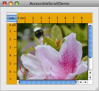
Let's use an accessibility utility to compare the original version of one of our demos to a version in which the rules for supporting accessibility have been applied. 让我们使用一个可访问性实用程序,将其中一个演示的原始版本与应用了支持可访问性规则的版本进行比较。Here's a picture of a program called 这是一个名为ScrollDemo.ScrollDemo的程序的图片。

Click the Launch button to run单击“启动”按钮,使用Java™Web启动运行ScrollDemousing Java™ Web Start (download JDK 7 or later).ScrollDemo(下载JDK 7或更高版本)。Or, to compile and run the example yourself, consult the example index.或者,要自己编译和运行示例,请查阅示例索引。
Next, click the Launch button to run单击“启动”按钮,使用Java™Web启动运行AccessibleScrollDemousing Java™ Web Start (download JDK 7 or later).AccessibleScrollDemo(下载JDK 7或更高版本)。Or, to compile and run the example yourself, consult the example index.或者,要自己编译和运行示例,请查阅示例索引。Compare the two versions side by side.并排比较两个版本。The only noticeable difference is that the cm toggle button and the photograph have tool tips in the accessible version.唯一明显的区别是cm切换按钮和照片在可访问版本中有工具提示。Now run the two versions under the accessibility utility called Monkey.现在在名为Monkey的可访问性实用程序下运行这两个版本。Note that when the accessibility tools have been downloaded and configured in the请注意,在accessibility.propertiesfile, the Monkey window automatically comes up when you click on the Run ScrollDemo and AccessibleScrollDemo links (in steps 1 and 2).accessibility.properties文件中下载并配置辅助工具后,当您单击Run ScrollDemo和AccessibleScrollDemo链接时,Monkey窗口会自动出现(步骤1和2中)。If the Monkey window does not appear on startup, the problem may be that the如果启动时没有出现Monkey窗口,问题可能是Java Web Start使用的VM版本中不存在accessibility.propertiesfile is not present in the version of the VM being used by Java Web Start.accessibility.properties文件。You can change the VM you use by running the Java Web Start Application Manager and selecting File > Preferences > Java.您可以通过运行Java Web Start应用程序管理器并选择“文件”>“首选项”>“Java”来更改所使用的VM。Note that when the Monkey window comes up you need to select File > Refresh Trees to see information appear under请注意,当“Monkey”窗口出现时,您需要选择“文件”>“刷新树”以查看“Accessible Tree”下显示的信息。Accessible Tree.You can then expand the tree by successively clicking on the horizontal icons displayed by each folder icon.然后,您可以通过依次单击每个文件夹图标显示的水平图标来展开树。When the tree has been expanded, you can see detailed information for the various components.展开树后,可以看到各个组件的详细信息。The custom components (rules and corners) that weren't accessible in the original version are accessible in the modified version.在原始版本中无法访问的自定义组件(规则和角点)在修改后的版本中可以访问。This can make quite a difference to assistive technologies.这对辅助技术有很大的影响。
Here's a snapshot of Monkey running on 下面是Monkey在ScrollDemo:ScrollDemo上运行的快照:
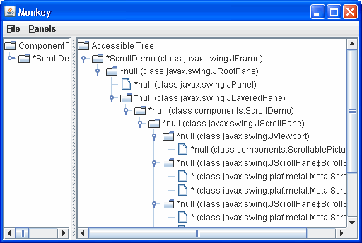
The left side of the split pane shows the actual component hierarchy for the program. 拆分窗格的左侧显示了程序的实际组件层次结构。The right side shows the accessible components in the hierarchy, which is what interests us.右侧显示了层次结构中可访问的组件,这正是我们感兴趣的地方。
The first thing to notice is that, even with no explicit support in 首先要注意的是,即使ScrollDemo, Monkey is able to discover a lot of information about the various components in the program. ScrollDemo中没有明确的支持,Monkey也能够发现关于程序中各种组件的大量信息。Most of the components and their children appear in the tree. 大多数组件及其子组件都显示在树中。However, the names for most of the components are empty (null), which is rather unhelpful. 然而,大多数组件的名称都是空的(null),这是非常无益的。The descriptions are also empty.描述也是空的。
Further trouble comes with the program's custom components. 程序的自定义组件会带来更多问题。The two rulers are inaccessible, so they are not included in the accessible tree. 这两个标尺不可访问,因此它们不包含在可访问树中。The viewports that contain the rulers are displayed as leaf nodes because they have no accessible children. 包含标尺的视口显示为叶节点,因为它们没有可访问的子节点。The custom corners are also missing from the accessible tree.可访问树中也缺少自定义角。
Now here's a picture of the Monkey window for 下面是AccessibleScrollDemo:AccessibleScrollDemo的Monkey窗口的图片:
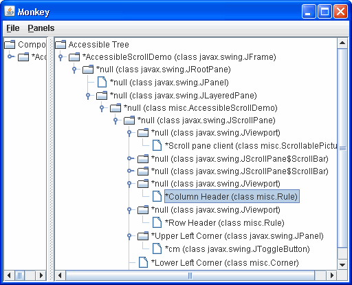
The rules are now listed as children of the viewports, and the corners are listed as children of the scroll pane. 规则现在列为视口的子项,角点列为滚动窗格的子项。Furthermore, many of the components now have non-null names.此外,许多组件现在具有非空名称。
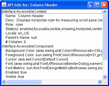
In the previous snapshot of Monkey, the Column Header item is selected. 在Monkey的上一个快照中,选择了列标题项。Monkey highlights the corresponding component in Monkey突出显示ScrollDemo program.ScrollDemo程序中的相应组件。
When an item is selected, you can use Monkey's Panels menu to bring up one of four different panels that let you interact with the selected component. 选择项目后,可以使用Monkey的“面板”菜单调出四个不同面板中的一个,让您可以与选定组件交互。Choosing Panels > Accessibility API panel brings up a panel like the one shown in the following figure. 选择“面板”>“可访问性API面板”将显示如下图所示的面板。This panel displays information available through methods defined in the 此面板显示可通过AccessibleContext base class and the AccessibleComponent interface.AccessibleContext基类和AccessibleComponent接口中定义的方法获得的信息。
Monkey has three other panels:Monkey还有三个面板:
- AccessibleAction:
Shows the actions supported by an accessible component and lets you invoke the action.显示可访问组件支持的操作,并允许您调用该操作。Works only with an accessible component whose context implements the仅适用于其上下文实现AccessibleActioninterface.AccessibleAction接口的可访问组件。 - AccessibleSelection
: Shows the current selection of an accessible component and lets you manipulate the selection.:显示可访问组件的当前选择,并允许您操纵选择。Works only with accessible component whose context implements the仅适用于上下文实现AccessibleSelectioninterface.AccessibleSelection接口的可访问组件。 - AccessibleHypertext
: Shows any hyperlinks contained within an accessible component and lets you traverse them.:显示可访问组件中包含的任何超链接,并允许您遍历它们。Works only with accessible component whose context implements the仅适用于上下文实现AccessibleHypertextinterface.AccessibleHypertext接口的可访问组件。
The accessibility utilities examples are handy as testing tools and can give you an idea of how accessible the components in your program are. 可访问性实用程序示例作为测试工具非常方便,可以让您了解程序中组件的可访问性。However, even if your components behave well in Monkey or the other examples, they still might not be completely accessible because Monkey and the other examples exercise only certain portions of the Accessibility API.然而,即使您的组件在Monkey或其他示例中表现良好,它们仍然可能无法完全访问,因为Monkey和其他示例只使用Accessibility API的某些部分。
The only true test of accessibility is to run your programs with real-world assistive technologies, however, you may find the following free and open source screen reader useful: 唯一真正的可访问性测试是使用真实世界的辅助技术运行程序,然而,您可能会发现以下免费开源屏幕阅读器很有用:NonVisual Desktop Access (NVDA).
Setting Accessible Names and Descriptions on Components在组件上设置可访问的名称和描述
Giving your program's components accessible names and descriptions is one of the easiest and most important steps in making your program accessible. 为程序的组件提供可访问的名称和描述是使程序可访问的最简单和最重要的步骤之一。Following is a complete listing of the 下面是创建滚动窗格的AccessibleScrollDemo constructor that creates the scroll pane and the custom components it uses. AccessibleScrollDemo构造函数及其使用的自定义组件的完整列表。The boldface statements give components names and descriptions that assistive technologies can use.粗体语句给出了辅助技术可以使用的组件名称和描述。
public AccessibleScrollDemo() {
    // Get the image to use.
ImageIcon bee = createImageIcon("images/flyingBee.jpg",
                      "Photograph of a flying bee.");

    // Create the row and column headers.
    columnView = new Rule(Rule.HORIZONTAL, true);
    if (bee != null) {
        columnView.setPreferredWidth(bee.getIconWidth());
    } else {
        columnView.setPreferredWidth(320);
    }
columnView.getAccessibleContext().setAccessibleName("Column Header");
columnView.getAccessibleContext().
            setAccessibleDescription("Displays horizontal ruler for " +
                                     "measuring scroll pane client.");
    rowView = new Rule(Rule.VERTICAL, true);
    if (bee != null) {
        rowView.setPreferredHeight(bee.getIconHeight());
    } else {
        rowView.setPreferredHeight(480);
    }
rowView.getAccessibleContext().setAccessibleName("Row Header");
rowView.getAccessibleContext().
            setAccessibleDescription("Displays vertical ruler for " +
                                     "measuring scroll pane client.");

    // Create the corners.
    JPanel buttonCorner = new JPanel();
    isMetric = new JToggleButton("cm", true);
    isMetric.setFont(new Font("SansSerif", Font.PLAIN, 11));
    isMetric.setMargin(new Insets(2,2,2,2));
    isMetric.addItemListener(this);
isMetric.setToolTipText("Toggles rulers' unit of measure " +
                            "between inches and centimeters.");
    buttonCorner.add(isMetric); //Use the default FlowLayout
buttonCorner.getAccessibleContext().
                 setAccessibleName("Upper Left Corner");
String desc = "Fills the corner of a scroll pane " +
                  "with color for aesthetic reasons.";
    Corner lowerLeft = new Corner();
lowerLeft.getAccessibleContext().
              setAccessibleName("Lower Left Corner");
lowerLeft.getAccessibleContext().setAccessibleDescription(desc);

    Corner upperRight = new Corner();
upperRight.getAccessibleContext().
               setAccessibleName("Upper Right Corner");
upperRight.getAccessibleContext().setAccessibleDescription(desc);

    // Set up the scroll pane.
    picture = new ScrollablePicture(bee,
                                    columnView.getIncrement());
picture.setToolTipText(bee.getDescription());
picture.getAccessibleContext().setAccessibleName(
                                     "Scroll pane client");

    JScrollPane pictureScrollPane = new JScrollPane(picture);
    pictureScrollPane.setPreferredSize(new Dimension(300, 250));
    pictureScrollPane.setViewportBorder(
            BorderFactory.createLineBorder(Color.black));

    pictureScrollPane.setColumnHeaderView(columnView);
    pictureScrollPane.setRowHeaderView(rowView);

    // In theory, to support internationalization you would change
    // UPPER_LEFT_CORNER to UPPER_LEADING_CORNER,
    // LOWER_LEFT_CORNER to LOWER_LEADING_CORNER, and
    // UPPER_RIGHT_CORNER to UPPER_TRAILING_CORNER.  In practice,
    // bug #4467063 makes that impossible (at least in 1.4.0).
    pictureScrollPane.setCorner(JScrollPane.UPPER_LEFT_CORNER,
                                buttonCorner);
    pictureScrollPane.setCorner(JScrollPane.LOWER_LEFT_CORNER,
                                lowerLeft);
    pictureScrollPane.setCorner(JScrollPane.UPPER_RIGHT_CORNER,
                                upperRight);

    // Put it in this panel.
    setLayout(new BoxLayout(this, BoxLayout.X_AXIS));
    add(pictureScrollPane);
    setBorder(BorderFactory.createEmptyBorder(20,20,20,20));
}
Often, the program sets a component's name and description directly through the component's accessible context. 通常,程序直接通过组件的可访问上下文设置组件的名称和描述。Other times, the program sets an accessible description indirectly with tool tips. 其他时候,程序通过工具提示间接设置可访问的描述。In the case of the cm toggle button, the description is set automatically to the text on the button. 对于cm切换按钮,说明将自动设置为按钮上的文本。
Concepts: How Accessibility Works概念:无障碍工作原理
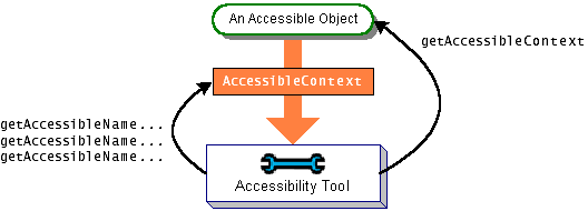
An object is accessible if it implements the 如果一个对象实现了Accessible interface. Accessible接口,那么它是可访问的。The Accessible interface defines just one method, getAccessibleContext, which returns an AccessibleContext object. The AccessibleContext object is an intermediary that contains the accessible information for an accessible object. The following figure shows how assistive technologies get the accessible context from an accessible object and query it for information:
AccessibleContext is an abstract class that defines the minimum set of information an accessible object must provide about itself. The minimum set includes name, description, role, state set, and so on. To identify its accessible object as having particular capabilities, an accessible context can implement one or more of the interfaces as shown in the Accessible Interfaces table. For example, JButton implements AccessibleAction, AccessibleValue, AccessibleText, and AccessibleExtendedComponent. It is not necessary for JButton to implement AccessibleIcon because that is implemented by the ImageIcon attached to the button.
Because the JComponent class itself does not implement the Accessible interface, instances of its direct subclasses are not accessible. If you write a custom component that inherits directly from JComponent, you need to explicitly make it implement the Accessible interface. JComponent does have an accessible context, called AccessibleJComponent, that implements the AccessibleComponent interface and provides a minimal amount of accessible information. You can provide an accessible context for your custom components by creating a subclass of AccessibleJComponent and overriding important methods. Making Custom Components Accessible shows two examples of doing this.
All the other standard Swing components implement the 所有其他标准Swing组件都实现了Accessible interface and have an accessible context that implements one or more of the preceding interfaces as appropriate. Accessible接口,并具有一个可访问的上下文,该上下文适当地实现了前面的一个或多个接口。The accessible contexts for Swing components are implemented as inner classes and have names of this style:Swing组件的可访问上下文被实现为内部类,并具有以下样式的名称:
Component.AccessibleComponent
If you create a subclass of a standard Swing component and your subclass is substantially different from its superclass, then you should provide a custom accessible context for it. The easiest way is to create a subclass of the superclass's accessible context class and override methods as necessary. For example, if you create a JLabel subclass substantially different from JLabel, then your JLabel subclass should contain an inner class that extends AccessibleJLabel. The next section shows how to do so, using examples in which JComponent subclasses extend AccessibleJComponent.
Making Custom Components Accessible使自定义组件可访问
The scroll demo program uses three custom component classes. 滚动演示程序使用三个自定义组件类。ScrollablePicture is a subclass of JLabel, and Corner and Rule are both subclasses of JComponent.
The ScrollablePicture class relies completely on accessibility inherited from JLabel through JLabel.AccessibleJLabel. The code that creates an instance of ScrollablePicture sets the tool-tip text for the scrollable picture. The tool-tip text is used by the context as the component's accessible description. This behavior is provided by AccessibleJLabel.
The accessible version of the Corner类的可访问版本只包含足够的代码来访问其实例。Corner class contains just enough code to make its instances accessible. We implemented accessibility support by adding the code shown in bold to the original version of 我们通过在Corner.Corner的原始版本中添加粗体显示的代码来实现可访问性支持。
public class Corner extends JComponent implements Accessible {

    protected void paintComponent(Graphics g) {
        //Fill me with dirty brown/orange.
        g.setColor(new Color(230, 163, 4));
        g.fillRect(0, 0, getWidth(), getHeight());
    }

    public AccessibleContext getAccessibleContext() {
        if (accessibleContext == null) {
            accessibleContext = new AccessibleCorner();
        }
        return accessibleContext;
    }

    protected class AccessibleCorner extends AccessibleJComponent {
        //Inherit everything, override nothing.
    }
}
All of the accessibility provided by this class is inherited from 该类提供的所有可访问性都继承自AccessibleJComponent. AccessibleJComponent。This approach is fine for Corner because AccessibleJComponent provides a reasonable amount of default accessibility information and because corners are uninteresting: they exist only to take up a little bit of space onscreen. Other classes, such as Rule, need to provide customized information.
Rule provides an accessible context for itself in the same manner as Corner, but the context overrides two methods to provide details about the component's role and state:
protected class AccessibleRuler extends AccessibleJComponent {

    public AccessibleRole getAccessibleRole() {
        return AccessibleRuleRole.RULER;
    }

    public AccessibleStateSet getAccessibleStateSet() {
        AccessibleStateSet states =
            super.getAccessibleStateSet();
        if (orientation == VERTICAL) {
            states.add(AccessibleState.VERTICAL);
        } else {
            states.add(AccessibleState.HORIZONTAL);
        }
        if (isMetric) {
            states.add(AccessibleRulerState.CENTIMETERS);
        } else {
            states.add(AccessibleRulerState.INCHES);
        }
        return states;
    }
}
AccessibleRole is an enumeration of objects that identify roles that Swing components can play. 是标识Swing组件可以扮演的角色的对象的枚举。It contains predefined roles such as label, button, and so on. 它包含预定义的角色,如标签、按钮等。The rulers in our example don't fit well into any of the predefined roles, so the program invents a new one in a subclass of 我们示例中的规则不适合任何预定义的角色,因此程序在AccessibleRole:AccessibleRole的子类中创建了一个新的规则:
class AccessibleRuleRole extends AccessibleRole {
    public static final AccessibleRuleRole RULER
        = new AccessibleRuleRole("ruler");

    protected AccessibleRuleRole(String key) {
        super(key);
    }

    //Should really provide localizable versions of these names.
    public String toDisplayString(String resourceBundleName,
                                  Locale locale) {
        return key;
    }
}
Any component that has state can provide state information to assistive technologies by overriding the 任何具有状态的组件都可以通过重写getAccessibleStateSet method. getAccessibleStateSet方法向辅助技术提供状态信息。A rule has two sets of states: its orientation can be either vertical or horizontal, and its units of measure can be either centimeters or inches. 规则有两种状态:其方向可以是垂直的或水平的,其度量单位可以是厘米或英寸。AccessibleState is an enumeration of predefined states. This program uses its predefined states for vertical and horizontal orientation. Because AccessibleState contains nothing for centimeters and inches, the program makes a subclass to provide appropriate states:
class AccessibleRulerState extends AccessibleState {
    public static final AccessibleRulerState INCHES
        = new AccessibleRulerState("inches");
    public static final AccessibleRulerState CENTIMETERS
        = new AccessibleRulerState("centimeters");

    protected AccessibleRulerState(String key) {
        super(key);
    }

    //Should really provide localizable versions of these names.
    public String toDisplayString(String resourceBundleName,
                                  Locale locale) {
        return key;
    }
}
You've seen how to implement accessibility for two simple components, that exist only to paint themselves onscreen. Components that do more, such as responding to mouse or keyboard events, need to provide more elaborate accessible contexts. You can find examples of implementing accessible contexts by delving in the source code for the Swing components.
The Accessibility API
The tables in this section cover just part of the accessibility API. For more information about the accessibility API, see the API documentation for the classes and packages in the accessibility package. Also, refer to the API documentation for the accessible contexts for individual Swing components.
The API for supporting accessibility falls into the following categories:
| Method | Purpose |
|---|---|
| getAccessibleContext().setAccessibleName(String) getAccessibleContext().setAccessibleDescription(String) (on a JComponent or Accessible object) |
Provide a name or description for an accessible object. |
| void setToolTipText(String) (in JComponent) |
Set a component's tool tip. If you don't set the description, than many accessible contexts use the tool-tip text as the accessible description. |
| void setLabelFor(Component) (in JLabel) |
Associate a label with a component. This tells assistive technologies that a label describes another component. |
| void setDescription(String) (in ImageIcon) |
Provide a description for an image icon. |
| Interface or Class | Purpose |
|---|---|
| Accessible (an interface) |
Components that implement this interface are accessible. Subclasses of JComponent must implement this explicitly. |
| AccessibleContext JComponent.AccessibleJComponent (an abstract class and its subclasses) |
AccessibleContext defines the minimal set of information required of accessible objects. The accessible context for each Swing component is a subclass of this and named as shown. For example, the accessible context for JTree is JTree.AccessibleJTree. To provide custom accessible contexts, custom components should contain an inner class that is a subclass of AccessibleContext. For more information, see Making Custom Components Accessible. |
| AccessibleRole AccessibleStateSet (classes) |
Define the objects returned by an AccessibleContext object's getAccessibleRole and getAccessibleStateSet methods, respectively. |
| AccessibleRelation AccessibleRelationSet |
Define the relations between components that implement this interface and one or more other objects. |
| Interface | Purpose |
|---|---|
| AccessibleAction | Indicates that the object can perform actions. By implementing this interface, the accessible context can give information about what actions the accessible object can perform and can tell the accessible object to perform them. |
| AccessibleComponent | Indicates that the accessible object has an onscreen presence. Through this interface, an accessible object can provide information about its size, position, visibility and so on. The accessible contexts for all standard Swing components implement this interface, directly or indirectly. The accessible contexts for your custom components should do the same. The AccessibleExtendedComponent method is preferred. |
| AccessibleEditableText |
Indicates that the accessible object displays editable text. In addition to the information available from its superinterface, AccessibleText, methods are provided for cutting, pasting, deleting, selecting, and inserting text. |
| AccessibleExtendedComponent |
In addition to the information available from its superinterface, AccessibleComponent, methods are provided for obtaining key bindings, border text, and tool-tip text. |
| AccessibleExtendedTable |
In addition to the information available from its superinterface, AccessibleTable, methods are provided to convert between an index and its row or column. |
| AccessibleHypertext | Indicates that the accessible object contains hyperlinks. Through this interface, an accessible object can provide information about its links and allow them to be traversed. |
| AccessibleIcon | Indicates that the accessible object has an associated icon. Methods are provided that return information about the icon, such as size and description. |
| AccessibleKeyBinding |
Indicates that the accessible object supports one or more keyboard shortcuts that can be used to select the object. Methods are provided that return the key bindings for a given object. |
| AccessibleSelection | Indicates that the accessible object can contain a selection. Accessible contexts that implement this interface can report information about the current selection and can modify the selection. |
| AccessibleTable | Indicates that the accessible object presents data in a two-dimensional data object. Through this interface information about the table such as table caption, row and column size, description, and name are provided. The AccessibleExtendedTable method is preferred. |
| AccessibleText | Indicates that the accessible object displays text. This interface provides methods for returning all or part of the text, attributes applied to it, and other information about the text such as its length. |
| AccessibleValue | Indicates that the object has a numeric value. Through this interface an accessible object provides information about its current value and its minimum and maximum values. |
Examples that Use the Accessibility API
The following table lists some of our examples that have good support for assistive technologies.
| Example | Where Described | Notes |
|---|---|---|
AccessibleScrollDemo |
This section | Contains two custom components that implement the Accessible interface. To see a less accessible version of this program see How to Use Scroll Panes. |
ButtonDemo |
How to Use the Common Button API | Uses three buttons. Supports accessibility through button text, mnemonics, and tool tips. |