13 Creating Responsive Layouts with CSS
When it comes to website layouts, the choice is likely to fall mostly on the responsive variants because here you no longer have to worry about the different screen sizes. This chapter provides an introduction on how to create responsive websites.
The way you should create your layouts isn’t set in stone, nor is there a right or wrong here. Today, responsive layouts are used for this purpose, which deliver a web page that fits the width of the visitor’s device. This chapter describes what responsive layouts are all about and how you can implement them.
Before we get started, here’s an overview of what you’ll learn in this chapter:
-
The basic handling of media queries
-
The fundamentals of what is important in responsive web design
-
How to create a simple responsive layout
-
How to use the CSS grid for responsive web design
To temper expectations a bit here, it’s worth mentioning that you’ll only learn the basics of what responsive layouts are and how you can use them in practice. The examples in this chapter are kept relatively simple. Responsive web design is a vast, ever-evolving subject, and there’s a reason that entire books are devoted to it. Still, by the end of the chapter, you’ll know what that’s all about and how you can create responsive layouts.
13.1 Basic Theoretical Knowledge of Responsive Web Design
The way we access the internet today has become very versatile. Whereas a few years ago, a website was only viewed with a desktop PC or laptop, today many other devices such as tablets, smartphones, e-book readers, game consoles, or TV sets have joined the ranks. The challenge here is to respond to the screen size and screen resolution of each device with an appropriate layout.
Prior to the era of responsive web design, the appearance of a website was quite dependent on the device used to view it. Websites used to be optimized for the screen resolution of a desktop PC, but nowadays you have to rethink a little due to the rapidly increasing market share of smartphones and tablets. Standard smartphone resolutions start at 320–480 pixels, tablets are often 768–1,024 pixels, and common desktop PCs start at 1,024 pixels. Offering different mobile and desktop versions of a website is one way to solve the problem. However, that would take a considerable effort, and when a new tablet or smartphone format of the next generation is due, another version of the layout would become necessary.
Most of the time, the mobile-only versions were just stripped-down versions with reduced functionality of the desktop version, and they were swapped out to a subdomain with a single-column layout with m or mobile (e.g., mobile.mydomain.com). At the latest since the introduction of mobile devices such as smartphones and tablets, these slimmed-down mobile versions of a website are no longer satisfactory. In addition, the web browsers on mobile devices were and are technically on a very high level and at least equal to the desktop variants. It would therefore be a shame to give away the potential with a slimmed-down mobile version.
Mobile Dominates
Recent statistics confirm the trend that mobile devices are now the most used devices when visitors are on the web.
Instead of creating and maintaining countless layout versions for the same website, responsive web design or responsive layout is used. This technique takes into account the characteristics of the end device to adapt the website to achieve an optimal and user-friendly display for the end device. The main criteria for such a customized layout are the screen size (usually width) of the device and possibly the available input methods (mouse or touch screen).
The meaning of responsive is something like reacting. This sounds strange and is rather rarely used this way, but it sums things up quite well because with this technique, the structural design and content of a website reacts to the screen resolution of the users’ devices, and the layout is output accordingly. So, when we talk about responsive layouts, the website adapts to the users’ screens.
13.1.1 Using Specific Media Types
The idea of responding to specific media types has been around for a long time in CSS, which I covered briefly in Chapter 8, Section 8.3.8. In doing so, we’ve provided various separate stylesheets for the different output media such as the screen (media="screen") or the printer (media="print" ):
...
<link href="css/screen.css" rel="stylesheet" media="screen">
<link href="css/print.css" rel="stylesheet" media="print">
...
Listing 13.1 /examples/chapter013/13_1_1/index.html
Using the link element, you can provide a version for the screen (media="screen") and a specific version for the printer. You can see the version for the screen with screen.css in Figure 13.1.
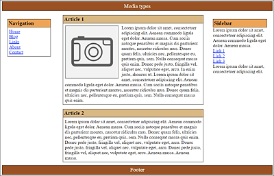
Figure 13.1 The Web Page Was Styled with the CSS Version for the Screen (“media="screen"”)
The second version with print.css, also provided with the link element, is intended for the printer (media="print") as the output medium. Without going into the content of the CSS file here, color has been omitted from this version, and borders have been removed. In addition, the <header>, <nav>, <aside>, and <footer> elements were hidden using display: none to print only the actual content of the article elements. You can see the version for the printer with print.css in Figure 13.2.
If, on the other hand, the media type isn’t defined, then the CSS statements automatically apply to all output types; this corresponds to media="all".
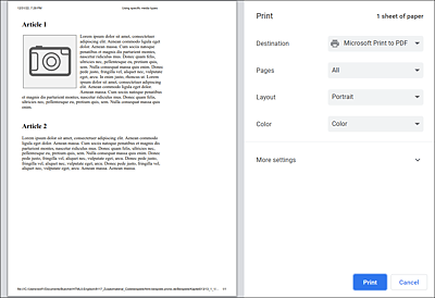
Figure 13.2 The print.css Version for the Printer (“media="print"”) in Use
The two CSS files, print.css and screen.css, for this example can be found in /examples/chapter013/13_1_1/css/.
Defining Media-Specific Sections via CSS Rule “@media”
Within a CSS file, you can use @media [media type] to define the CSS properties for different media types in curly brackets:
@media screen {
  /* CSS features for the screen */
}
@media print {
  /* CSS features for the printer */
}
You can also combine formatting in CSS with an @media rule within a style element in the HTML document:
...
    <style>
      @media screen {
        /* CSS features for the screen */
        ...
      }
      @media print {
        /* CSS features for the printer */
        ...
      }
    <style>
...
13.1.2 Media Queries for Media Features
In addition to media types, CSS can also be used to perform media queries of media features. Such queries are at the same time the heart of responsive web design. This allows you to make media queries—for example, regarding the size of the device, screen resolution, orientation (portrait or landscape), or input options (mouse, touch, keyboard, speech)—and respond accordingly with an appropriate design.
13.1.3 Integrating and Applying Media Queries for Media Features
The media features can be integrated and used in different ways. For example, you can write the use of such a media query in HTML as follows:
...
<head>
  <link rel="stylesheet" href="css/basis.css">
  <link rel="stylesheet" media="screen and (max-width: 480px)"
       href="css/mobile.css">
</head>
...
Here, mobile.css is used only if the maximum screen width of 480 pixels doesn’t get exceeded. For devices with a higher resolution, only basis.css will be used. Older web browsers that use this media query (here, media="screen and (max-width: 480px)"), ignore this query and always use basis.css—even if the screen is less than 480 pixels wide.
It’s also important to note that when using media queries, such as the one with the link element, all existing stylesheets will be downloaded, even if they don’t apply to the query at all, but they won’t be executed. So, in the preceding example, base.css and mobile.css are always loaded. The reason for this is to prevent a possible delay due to reloading when the web browser window gets resized or the orientation of the smartphone or tablet changes.
Integrating queries in the opening <style> tag is possible as follows:
...
<style type="text/css" media="screen and (max-width: 480px)">
   /* CSS statements for screen up to max. 480 pixels */
<style>
...
Besides the link and style elements, you can also write media queries of features as @media rules within a stylesheet:
...
.mainarticle {
  background-color: yellow;
}
@media screen and (max-width: 480px) {
  .mainarticle {
    background-color: orange;
  }
}
...
Here, the @media rule to color the background of .mainarticle orange is used only if the maximum screen size hasn’t exceeded 480 pixels. Otherwise, the background of .mainarticle will be colored yellow.
Finally, the media feature queries can be used with the @import rule as follows:
@import url('css/mobile_480.css') screen and (max-width: 480px);
Thus, you can use media feature queries in HTML with the link element or in the style element, and in CSS with the @media or @import rule.
13.1.4 Basic Structure of a Media Feature Query
Now that you know how to use media queries in HTML or in CSS, let’s take a closer look at the structure of such a query. For this purpose, we want to decompose the query screen and (max-width: 480px) into its individual components.
In Figure 13.3, you can see a media query and its individual components. Such a query consists of a Media Type (or output device) followed by a Link with and. Inside the Expression, a Media Feature (or property) and a corresponding Value are written between parentheses. I already described and listed the media types or the output devices in Chapter 8, Section 8.3.8.
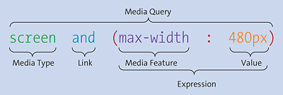
Figure 13.3 Individual Components of a Media Query
Linking the Media Features
The media feature gets linked via the keyword and. It’s quite possible to link and process several and features. Linking can be done with and without a media type. Accordingly, a theoretical example of multiple links may look like the following:
@media screen and (min-width: 960px) {
  /* CSS statements for desktop */
}
@media screen and (min-width: 768px) and (max-width: 960px) {
  /* CSS statements for tablets and netbooks */
}
@media screen and (max-width: 480px) {
  /* CSS statements for smartphones */
}
In the second media query, the stylesheet in between is used only if all expressions and criteria linked via and are satisfied. In the example, the media type must be a screen, and the screen width must be at least 768 pixels and no more than 960 pixels.
If you use a media type, you can add a specification with only in front of the media type. With only, you make sure that older web browsers can’t do anything with the media query. Sounds quite pointless, but it isn’t. First, here’s an example without only:
...
@media screen and (max-width: 480px) {
  /* CSS statements for smartphones */
}
...
A very old web browser may not be able to do anything with and (max-width: 480px) but is familiar with @media screen. To make sure that the web browser will ignore the specification of and (max-width: 480px) so that the CSS statements for smartphones will also be used on a desktop, you can put the keyword only in front of screen because older web browsers then won’t know what to do with the query:
...
@media only screen and (max-width: 480px) {
  /* CSS statements for smartphones */
}
...
If you’ve used a media type, you can also prefix not and thus negate a query.
13.1.5 Which Media Features Can Be Queried?
The different output devices have many different features. Without a doubt, the most frequently used feature that’s queried is the minimum and maximum width of the display area. Table 13.1 contains an overview of the most important media features that can be queried. An overview of all media features can be found at www.w3.org/TR/mediaqueries-4/.
|
Media Feature |
Meaning |
Values |
|---|---|---|
|
|
Width of the display area (viewport) of the web browser. Possible values are positive length values. Example: |
|
|
|
Height of the display area (viewport) of the web browser. Possible values are positive length values. Example: |
|
|
|
This enables you to query the orientation of the device. The orientation can be |
|
|
|
Specifies the aspect ratio of |
Width/height, for example, |
|
|
Query for the color depth of the device. For black-and-white devices, the value is |
Integer value (integer) |
|
|
Checks the use of indexed colors of the output device. |
Integer value (integer) |
|
|
Checks if the output device is monochrome. The value |
Integer value (integer) |
|
|
Query for the pixel density of the device, for example, |
|
|
|
Tests if the output device provides a mouse as an input device (or any input device at all). |
|
|
|
Checks if the output device provides hover effects with the primary input device. |
|
Table 13.1 Some Common Media Features That Can Be Queried via Media Queries
The “min” and “max” Prefixes
Particularly for the media features for the display area, it’s usually more useful to use the versions with the min or max prefixes because one rarely knows the exact width of the user’s display. For example, instead of using a media query where the exact width is queried with width, you should prefer the min-width and/or max-width version, which reacts even if the display width is at least or at most equal to the passed value.
13.1.6 Crucially Important: The Viewport for Mobile Devices
Especially in terms of querying media features from mobile devices, the viewport plays an essential role in ensuring that responsive web design works as intended there. Here, the viewport on desktop computers and the viewport on mobile devices often cause some confusion. The fact that high-resolution displays have an increasing market share makes things even more complicated because a pixel is suddenly no longer a pixel. A look at the website http://screensiz.es/ will show you a collection of the many different sizes of displays on different devices. In the collection, you’ll also find different width specifications for "width" and "device-width", which is due to the high-resolution displays just mentioned. I’ll keep it as simple as possible at this point and won’t bother you with the various viewport terms. Rather, I’ll show you how to solve the problem with a single line.
In terms of desktop computers, the viewport is the inner area of the browser window without the borders. When you reduce or enlarge the browser window, the viewport gets reduced or enlarged too. You can address this visual viewport with the media features, width and height. On mobile devices such as a smartphone, the screens are much smaller than on a desktop computer, but the viewport there is often larger than on desktop screens. Therefore, without special adaptations of the viewport for mobile devices, the website would be displayed on these devices in the width of a typical desktop screen. The viewport on mobile devices is often referred to as the layout viewport.
In Figure 13.4, you can see the website www.nytimes.com on a desktop screen, and, in Figure 13.5, you see the same website in the Safari browser of an iPhone where the viewport hasn’t been adapted for mobile devices. On the mobile device, the view has therefore been automatically scaled to fit the entire screen, just like on a desktop screen. Here, the layout viewport of the mobile device is scaled to the visual viewport, so to speak. As a result, you get unreadable text and everything in a thumbnail view that’s much too small. To read the text and reports on the mobile device, you would need to zoom in and then scroll up and down or right and left.
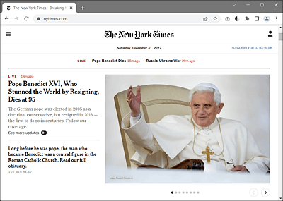
Figure 13.4 The New York Times Website on an Ordinary Desktop Screen
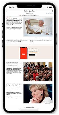
Figure 13.5 The New York Times Website without a Customized Viewport on a Smartphone
The mobile issue can be easily fixed with the viewport metatag or the CSS rule, @viewport. To do this, you need to add the following to the head section of the HTML document:
<meta name="viewport" content="width=device-width, initial-scale=1.0">
You can use width=device-width to set the width of the layout viewport to the width of the visual viewport. This line normalizes all different layout viewports from different devices and adjusts them to the current display size. You then don’t have to worry about the different display sizes and can devote yourself to responsive web design in peace. In addition to width, there’s the counterpart height=device-height for the height, which you’ll rarely need in practice. For the viewport setting width, you can also use pixel values.
Another important viewport feature is initial-scale:1.0, which lets you set the initial zoom value to 100% or 1:1. Here, you can also define smaller or larger values as the initial zoom level.
In addition to initial-scale, there are further viewport features such as minimum-scale or maximum-scale, which enable you to define the minimum and maximum zoom level. user-scalable=no even allows you to disable zooming completely. This may be convenient for web apps, but for websites, zoom-level restrictions aren’t recommended. You should keep in mind that there are website visitors who are depending on a high zoom level, and you would exclude those people from the website.
“@viewport” Rule
Going forward, the CSS rule @viewport will probably replace the metatag. Currently, however, the browser support for it is still very low (https://caniuse.com/#search=%40viewport). The advantage of the CSS rule is that theoretically more options can be used with it than with the viewport metatag, and thus it can be declared with different specifications in different media queries. The following is the equivalent counterpart to the preceding viewport metatag:
@viewport {
  width:device-width;
  zoom:1;
}
This specification corresponds to the following:
<meta name="viewport" content="width=device-width, initial-scale=1.0">
Of course, if you’ve customized the viewport on mobile devices, you still need to provide a rendering of the website that has been optimized for media queries. The viewport setting alone simply ensures that you turn off the web browser’s automatic scaling and take everything into your own hands from now on. You’ll learn how to create the responsive layout for it in the following sections. With regard to the website www.nytimes.com and the descriptions shown earlier in Figure 13.5, the website looks as shown in Figure 13.6 with the viewport adapted for mobile devices. Of course, the web developers of www.nytimes.com also provided an extra version for mobile devices via media queries, which I disabled in Figure 13.5 for demonstration purposes.
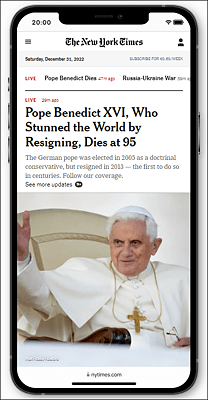
Figure 13.6 The New York Times Website with Adapted Viewport for Mobile Devices
13.1.7 Use “em” Instead of Pixels for a Layout Break in Media Queries
What’s also quite useful is to perform the media queries with the em unit. This may seem weird at first glance because the screen is actually measured in pixels. But the advantage here is that the media query then works correctly even if the font size gets changed via the operating system or the Zoom Text Only function in Firefox. This ensures that when the fonts are displayed in a larger text size, the next layout level will actually be triggered, and the layout won’t collapse. For example, for the website in Figure 13.7, the text was zoomed to the maximum using the Zoom Text Only feature in Firefox. In Figure 13.8, you can see what happens when pixels are used here instead of em. In Figure 13.9, however, em was used as the unit for layout wrapping in the media queries, and now the layout also reacts to the enlarged text display and selects the next layout level. Again, of course, this is assuming that an appropriate layout has been provided for it.

Figure 13.7 The Website after Loading in the Firefox Web Browser

Figure 13.8 Here, the “Zoom Text Only” Function Was Used, but Pixels Were Used for the Layout Wrap in the Media Queries: The Layout Is Gone
Figure 13.9 This Is What It Should Look Like When the “Zoom Text Only” Function Is Executed and the “em” Unit Is Used in the Layout Break of the Media Queries: The Mobile Layout Is Now Executed Here
Consider the following media query:
@media screen and (min-width: 640px) {
   /* CSS statements for screens 640 pixels wide and larger */
}
Here, you’ve set up a layout break (also called breakpoint) for screens of 640 pixels or more. All CSS statements between the curly brackets are thus only executed from a screen width of 640 pixels. With reference to the recommendation to use the em unit for such layout breaks, you only need to divide the screen width by 16. The default browser base font size is usually 16 (pixels) and is therefore used as a reference size. As 640 pixels divided by 16 pixels/em equals 40 em, you can use the following em specification for the layout break of 640 pixels:
/* 640px / 16px/em = 40em */
@media screen and (min-width: 40em) {
   /* CSS statements for screens 640 pixels wide and larger */
}
13.1.8 Layout Breaks (Breakpoints)
In the previous section, I briefly mentioned a layout breakpoint. Such layout breaks are essential for the flexibility of a website. With these breaks, the layout gets changed. In practice, you provide different layouts for different resolutions, which you can control by means of media queries. Several such layout breaks using media queries can be defined, for example, as follows:
/* CSS statements for screens up to 640 pixels wide */

/* 640px / 16px/em = 40em */
@media screen and (min-width: 40em) {
   /* CSS statements for screens 640 pixels wide and larger */
}
/* 1024px / 16px/em = 64em */
@media screen and (min-width: 64em) {
   /* CSS statements for screens 1024 pixels wide and larger */
}
/* 1280px / 16px/em = 80em */
@media screen and (min-width: 80em) {
   /* CSS statements for screens 1280 pixels wide and larger */
}
In this example, I’ve defined three common layout breaks using media queries. The statements before the first layout break will be executed in any case. Here, in addition to the basic CSS features, you could also define the mobile layout for the smartphones right away. Then you’ll find customized layouts for screen widths of 640 pixels (tablets), 1,024 pixels (desktop), and 1,280 pixels (extra-large desktop) as recommended with the em unit. According to the window width, the instructions are executed between the curly brackets.
However, the example isn’t intended to give the impression that you need to define so many layout breaks. Thus, it’s quite common to define only one layout for a mobile version and another layout for all other screens.
13.1.9 No More Math Games Thanks to "box-sizing: border-box;"
To avoid the embarrassment of having to recalculate later when creating the layout, you should use the newer box model with border-box right away. This means you don’t need to calculate width, padding, and border, as I demonstrated in Chapter 11, Section 11.1.6, and include this information at the same time. Especially with responsive web design, this is a considerable relief. I’ve already described the new box model in detail in Section 11.2.
For this reason, it’s recommended to set the following CSS statements right at the beginning:
html {
  box-sizing: border-box;
}
*, *::before, *::after {
  box-sizing: inherit;
}
13.1.10 What Happens to Web Browsers That Don’t Understand Media Queries?
Media queries are now understood by all mainstream web browsers. If you still encounter old web browsers or other clients that aren’t able to process media queries, then those web browsers will use the base version of your website that you defined with a media query before the first layout break. For example, if you’ve created a mobile version as the base version, the web browsers that can’t process media queries will get this mobile version. For this reason, it’s always recommended to create a basic version with a media query before the first layout breakpoint.