11 The Box Model of CSS
The basis for positioning elements and creating a layout in CSS is the box model. In this chapter, you’ll learn about the new and more intuitive box model of CSS in addition to the classic box model.
You’ve probably noticed that elements on websites consist of rectangular boxes or just boxes. Thanks to those rectangular boxes, it’s possible to position elements with CSS or to create the layout of websites.
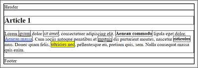
Figure 11.1 Websites Consist of Rectangular Boxes (or Just Boxes), Which Were Made Visible with CSS Here
In Figure 11.1, we used the universal selector to make all the rectangular boxes of the HTML elements visible as follows:
...
* { border: 1px solid black; }
...
Listing 11.1 /examples/chapter011/11/index.html
In this chapter, you’ll learn everything you need to know about the following:
-
Classic box model of CSS
-
Newer alternate box model of CSS
-
Styling of boxes with CSS
11.1 Classic Box Model of CSS
In Figure 11.1, you can see only a simple frame so that it seems that such a rectangular box consists only of a height and a width. But the box model also includes the following:
-
Actual content area (also content) of text and images, which is specified by
widthandheight -
Internal spacing (padding), which is specified with
padding -
Frame, which is written using
border -
Outer margin, which is specified using
margin
Thus, a box is composed of four boxes: a content box for the content, a padding box for the padding, a border box for the border, and a margin box for the margin. Each of these four boxes, in turn, can be divided into top, right, bottom, and left. Figure 11.2 shows a simple representation of the CSS box model.
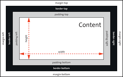
Figure 11.2 Classic CSS Box Model
11.1.1 Specifying the Content Area Using “width” and “height”
You can define the actual content area with the space for text and images using the CSS features width and height (see also Figure 11.2). If you don’t specify a special value for width, the HTML element will be as wide as the surrounding element. If no height is specified, all elements will be as high as the content is.
HTML Elements without “width” and “height”
There are elements, for example, strong, abbr, a, or em, where the height and width are automatically determined by the extent of the content. You can’t assign the CSS features width and height to such elements.
For example, in Figure 11.3, two article elements were formatted using the following CSS rules:
.article_01 { width: 300px; background: antiquewhite; }
.article_02 { width: 600px; background: antiquewhite; }
h_2 { background: sandybrown; }
Listing 11.2 /examples/chapter011/11_1/css/style.css
In Figure 11.3, you can see the example /examples/chapter011/11_1_1/index.html with the CSS code /examples/chapter011/11_1_1/css/style.css in use.
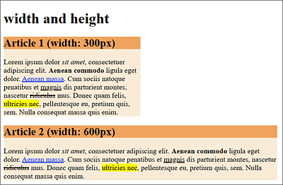
Figure 11.3 Two <article> Elements Were Each Defined via a Class Selector with a Fixed Width (“width”): Top Article Is 300 Pixels Wide, and Bottom Article Is 600 Pixels Wide
At this point, it’s slightly confusing at first that specifying the width in the classic box model with the CSS feature width doesn’t define the actual width of the element, but only the area with the content (width × height), as you can see in Figure 11.2.
You should also note that the height specification for height is only an initial value. If the content of the encompassing element is larger than the specified height, the content is still displayed and overflows the box, as shown in Figure 11.4. You can find the example for this in /examples/chapter011/11_1_1/index2.html.
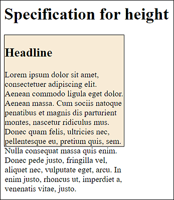
Figure 11.4 Text No Longer Fits into the Dimensions Specified for “width” (230 Pixels) and “height” (200 Pixels), Resulting in the Text “Flowing Out” of This Box
In real life, you’ll rarely define fixed values for the width (with width) and the height (with height). Responsive web design tends to use properties such as min-width (minimum width), min-height (minimum height), or max-height (maximum height) to allow flexible limits to suit the device or screen width.
CSS Feature “overflow”
If you want to prevent overflowing, you could use the CSS feature overflow (e.g., with the value hidden), which, however, will no longer display the oversized content.
11.1.2 Specifying the Inner Spacing Using “padding”
The inner padding (often only referred to as padding) of the box between the contents and the frame is indicated by padding (see Figure 11.2). This CSS feature assumes the background color of the content area if you’ve used one there. The CSS feature padding alone sets all four sides clockwise and is a short notation for padding-top (top inner spacing), padding-right (right inner spacing), padding-bottom (bottom inner spacing), and padding-left (left inner spacing).
11.1.3 Creating the Border Using “border”
The border encloses the padding and has its own CSS features for thickness (width), line style (style), and color (color). Similar to padding, you can use border to address all four sides at once. Again, you can access each of the four sides separately with border-top (top border line), border-right (right border line), border-bottom (bottom border line), and border-left (left border line).
Here’s another example, where you mark up two article elements, each 600 pixels wide, with width. Both article elements also get a border with a thickness of 10 pixels. To see the effects of padding here, the second article element was given an internal spacing (padding) of 50 pixels. Here are the corresponding CSS rules for this:
.article01 {
  width: 600px;
  border: 10px solid sienna;
  background-color: antiquewhite;
}
.article02 {
  width: 600px;
  padding: 50px;
  border: 10px solid peru;
  background-color: antiquewhite;
}
.h_2 { background-color: sandybrown;}
Listing 11.3 /examples/chapter011/11_1_3/css/style.css
In Figure 11.5, you can see the example /examples/chapter011/11_1_3/index.html with /examples/chapter011/11_1_3/css/style.css in use. Both article elements have a width of 600 pixels and a border of 10 pixels. For the bottom article element, you’ve also set up a padding of 50 pixels in all four directions via padding. Here, you can see that the padding also takes on the background color of the content area.
11.1.4 Setting Up the Outer Margin Using “margin”
At the very outside of the box model in Figure 11.2 you can see another outer margin with margin, which can also be written with margin-top (top outer margin), margin-right (right outer margin), margin-bottom (bottom outer margin), and margin-left (left outer margin) for all four directions individually. The outer margin has no color, is completely transparent, and therefore takes on the background color of the surrounding element.
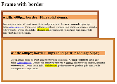
Figure 11.5 A Frame with “border”: One Frame with “padding” and One Without
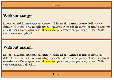
Figure 11.6 A <header> Element, Two <article> Elements, and One <footer> Element Are Framed, While No Outer Space with “margin” Has Been Used Yet
The example /examples/chapter011/11_1_4/css/style.css from Figure 11.7 can be found in /examples/chapter011/11_1_4/index.html. It should also be mentioned here that negative values are allowed for margin. The question as to how negative values affect margin depends on whether the elements are static, positioned, or floated.
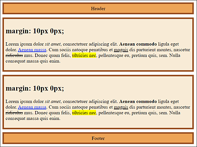
Figure 11.7 The <article> Element Has Been Set with an Outer Margin of 10 Pixels to the Top and Bottom (“margin: 10px 0px”)
11.1.5 Collapsing Margins
One initially somewhat confusing peculiarity of vertical margins must definitely be mentioned at this point. It concerns the vertical margins between two boxes placed one above the other. If the two margins touch each other, they won’t be added up, as might be assumed, but only the larger of the two margins will be used. The smaller margin gets virtually “swallowed” by the larger one.
Figure 11.8 demonstrates this process a bit more clearly. Here, two vertical boxes are on top of each other on the left-hand side, while the two margins are touching each other. For the top box, a margin of 20 pixels to the bottom was specified with margin-bottom. In the lower box, on the other hand, a margin of 10 pixels to the top was specified with margin-top.
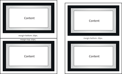
Figure 11.8 Vertical Margins That Touch Each Other Collapse into the Larger Value of the Two Margins
You can see the result of these two boxes stacked on top of each other on the right, where the two boxes collapse and the smaller of the two margins has been removed.
Nothing would change if you set the margin-top value of the bottom box to 19 pixels. Only if you set margin-top to 21 pixels would the lower margin be swallowed because with 20 pixels, it would then be the smaller margin.
Here’s a simple example that demonstrates how margin-bottom and margin-top collapse:
.headfoot {
  width: 600px;
  padding: 5px;
  border: 5px solid peru;
  background-color: antiquewhite;
  margin-bottom: 20px;
  text-align: center;
}
.article01 {
  width: 600px;
  padding: 5px;
  border: 5px solid sienna;
  background-color: antiquewhite;
  margin: 10px 0px;
}
Listing 11.4 /examples/chapter011/11_1_5/css/style.css
...
    <header class="headfoot">Header</header>
    <article class="article01">
       <h1>Article 1</h1>
       <p> ... </p>
    </article>
...
Listing 11.5 /examples/chapter011/11_1_5/index.html
In this example, the header element, which you address via the .headfoot class selector, and the article element, which is styled using the .article01 class selector, are on top of each other. For the header element, the margin is 20 pixels to the bottom (margin-bottom: 20px). For the article element, on the other hand, the margin to the top is 10 pixels (margin: 10px 0px). In total, the margin between the header and article elements is 20 pixels (rather than 30 pixels) because of the collapsing margin, which is the larger of the two values. The margin to the top of the article element is completely omitted here (it’s swallowed, as mentioned earlier), as you can see in Figure 11.9.
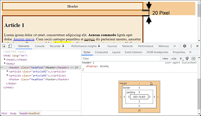
Figure 11.9 Two Collapsing Margins: Instead of the Mathematically Logical 30 Pixels, the Distance Here Is 20 Pixels
Horizontal Margins Don’t Collapse
When boxes touch each other horizontally, the margins don’t collapse but are added up normally.
The collapsing is intentional and serves to keep the spacing even for texts that consist of multiple paragraphs. For example, you can format a paragraph text with the following CSS rule:
p { margin: 1.2em; }
You then can obtain the following HTML structure, for example:
<h1>...</h1>
<p>1stParagraph</p>
<p>2ndParagraph</p>
<p>3rdParagraph</p>
In this way, you can be sure that the spacing of all three paragraphs is 1.2em thanks to the collapsing margins. If the margins didn’t collapse, the margin of <h1> to the first p element would still be 1.2em, but the margin of the second p element to the first and to the third p element would be 2.4em. Such giant gaps wouldn’t look nice at all.
So, when two vertical boxes touch each other on the outside, the following rules apply when they collapse or even merge:
-
If both values are the same, only one of them will be taken over.
-
If the values differ, the larger value will be used.
Preventing Collapsing Margins
The nasty thing about these collapsing margins is that you don’t even notice them as a problem at first, when the layout doesn’t want to work that way. Especially for headings, paragraphs, lists, or quotes, you can counteract this a bit by setting margin-top for these elements to 0. You can now easily control the distance to the next element with margin-bottom. In this way, the collapse almost doesn’t occur. The CSS rule for this looks as follows:
h1, h2, h3, h4, h5, h6,
p, ul, ol, blockquote {
   margin-top: 0;
}
11.1.6 Determining the Total Width and Total Height of a Box
Now that you know all the components of the classic box model, you can calculate the total width or height of a box. As an example, consider the following CSS code:
.headfoot {
  width: 600px;
  padding: 5px;
  border: 1px solid black;
  background-color: sandybrown;
  margin: 5px 0px;
  text-align: center;
}
.article01 {
  width: 600px;
  padding: 15px;
  border: 2px dotted sienna;
  background-color: antiquewhite;
}
Listing 11.6 /examples/chapter011/11_1_6/css/style.css
I’ve already pointed out that the width specification can be somewhat confusing because width doesn’t correspond to the actual width of a box. As you can clearly see in Figure 11.10 of /examples/chapter011/11_1_6/index.html, the header and footer are each shorter than the two articles, although in the example for all elements in /examples/chapter011/11_1_6/css/style.css, the specified width is 600 pixels (width: 600px).
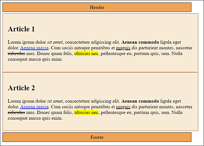
Figure 11.10 Despite Identical Width Specifications with “width”, the Boxes Are Displayed with Different Widths; To Adjust This Value, You Need to Calculate the Total Width
You can calculate the total width of a box by adding up width, padding-right, padding-left, border-right-width, border-left-width, margin-right, and margin-left. With regard to the two class selectors .headfoot and .article01, you’ll obtain the calculation listed in Table 11.1 as a result. This result shows that it can be helpful to do some simple math if the boxes don’t fit. In this example, the total width of the header and footer elements is 612 pixels. In contrast, the total width of the two article elements is 634 pixels.
|
CSS Feature |
.headfoot |
.article |
|---|---|---|
|
|
600 pixels |
600 pixels |
|
|
5 pixels |
15 pixels |
|
|
5 pixels |
15 pixels |
|
|
1 pixel |
2 pixels |
|
|
1 pixel |
2 pixels |
|
|
0 |
0 |
|
|
0 |
0 |
|
Total width |
612 pixels |
634 pixels |
Table 11.1 If the Boxes Don’t Fit, a Simple Addition Exercise Can Be Useful
Thus, the difference in total width between the header and footer elements and the article element is exactly 22 pixels (634 pixels – 612 pixels). At this point, you need to decide for yourself where to add or remove these 22 pixels. For example, one solution could be to set the width value for the .article01 class selector to 578px. You can find the CSS example in /examples/chapter011/11_1_6/css/style.css and the HTML document for it in /examples/chapter011/11_1_6/index2.html.