11.2 Newer Alternate Box Model of CSS
Not everyone will like the classic box model, where you specify width to determine the width of the content area and end up having to consider padding, border, and margin for the total width. However, as long as the specifications are made in terms of pixels, this is still a cumbersome calculation, but you can always realize a neat layout this way.
It gets a bit more complicated if you use different units for width, padding, border, or margin. For example, if you’ve specified a column with a width of 30% in a two-column layout and have written 5 pixels each for padding and border, it will be difficult to tell exactly how much space this column actually takes up in the layout. The problem was solved by using an inner <div> inside the corresponding column to specify padding, border, or margin there instead of in the actual column. For the actual column, only the width specification was used instead.
To make a long story short, with the newer alternate box model, you don’t have this problem with the math or trickery of adding another <div> inside a column for padding, border, or margin. With the new box model border-box, the width and height are no longer specified “only” for the content area, but these specifications also sensibly take into account the padding and the border. The CSS features width and height are the width and height from border-left to border-right and from border-top to border-bottom, respectively, as you can see in Figure 11.11.
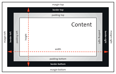
Figure 11.11 The New Box Model “border-box” Makes Your CSS Life a Lot Easier
If you write a width specification with width in this box model, padding and border will no longer have any influence on this specification and are subtracted from this width. Figure 11.12 shows the difference between the classic box model (top left) and the alternate box model (bottom left and top right) in terms of the CSS features width and height.
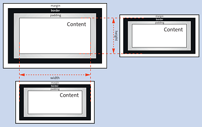
Figure 11.12 Top Left Shows the Classic Box Model; Bottom Left and Top Right Show the New Box Model with “box-sizing” Compared to the Width and Height Specifications
11.2.1 Using the “box-sizing” Box Model
To use the alternate box model, you must assign the border-box value to the CSS feature box-sizing. Possible values you can use for box-sizing are listed here:
-
content-box
This corresponds to the behavior of the classic box model, where the specification of thewidthandheightcorresponds to the content of the element in the box. -
border-box
As already described, in this specification, the value forwidthandheightcorresponds to the value fromborder-lefttoborder-rightand fromborder-toptoborder-bottom, respectively. Changingpaddingandborderwon’t change the width or height of the element anymore. You can see this box model in Figure 11.11 and Figure 11.12. -
inherit
This option allows you to adopt the value from the parent element.
11.2.2 Using the Alternate Box Model
Here’s an example to demonstrate the difference in use between the classic model and the alternate box model. Again, a header and footer (<header>, <footer>) and two articles (<article>) are styled, respectively:
.headfoot {
  width: 70%;
  padding: 5px;
  border: 2px solid black;
  background-color: sandybrown;
  text-align: center;
}
.article01 {
  width: 70%;
  padding: 15px;
  border: 1px dotted sienna;
  background-color: antiquewhite;
}
Listing 11.7 /examples/chapter011/11_2/css/style.css
In Figure 11.13, you can see in /examples/chapter011/11_2_2/index.html that despite the width specification of 70% for the class selectors .headfoot and .article01 in /examples/chapter011/11_2_2/css/style.css, the boxes are arranged differently because different specifications were made for padding and border.
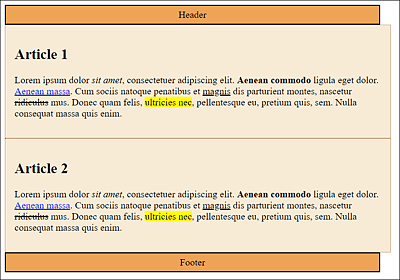
Figure 11.13 The Inconsistent Representation with the Classic Box Model
The problem with such a layout could be fixed relatively easily by adjusting the values of padding and border, for example, or even easier, by using the new box model with border-sizing: border-box;. Here’s the CSS snippet of the example with the new box model:
.headfoot {
  box-sizing: border-box;
  width: 70%;
  padding: 5px;
  border: 2px solid black;
  background-color: sandybrown;
  text-align: center;
}
.article01 {
  box-sizing: border-box;
  width: 70%;
  padding: 15px;
  border: 1px dotted sienna;
  background-color: antiquewhite;
}
You can avoid this double use of the box model specification by putting the new box model into a universal selector right at the beginning of the stylesheet. The alternative to the example just shown would look as follows:
* {
  box-sizing: border-box;
}
.headfoot {
  width: 70%;
  padding: 5px;
  border: 2px solid black;
  background-color: sandybrown;
  text-align: center;
}
.article01 {
  width: 70%;
  padding: 15px;
  border: 1px dotted sienna;
  background-color: antiquewhite;
}
Listing 11.8 /examples/chapter011/11_2/css/style2.css
As you can see in Figure 11.15 of /examples/chapter011/11_2/index2.html, all boxes are displayed consistently at 70%, no matter what values you used for padding and border. By using the new box model with border-box, padding and border get subtracted from the width and are no longer added. Similarly, this applies to the height via height.
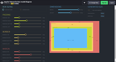
Figure 11.14 An Interactive Box Model
The new box model with box-sizing can indeed simplify CSS life considerably. Its strengths come into play when you use percentage values for width and pixel values for padding or border, for example, when you mix different units. For example, if you’ve defined a column with 30% width with box-sizing: border-box;, it doesn’t matter what values and units you use for padding and border—it will remain 30% for the total width of the column.
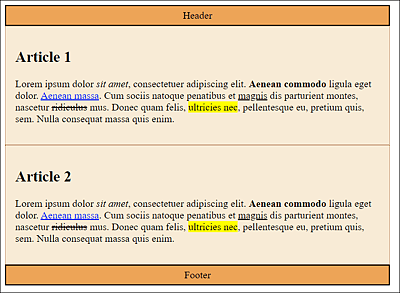
Figure 11.15 The Display with the New Box Model No Longer Causes Any Problems
Interactive Box Model Diagram
A great interactive box model, both with the classic and alternate box model, can be found at https://codepen.io/carolineartz/full/ogVXZj. Depending on the selected box model, you can adjust the individual specifications such as width, height, padding, border, and margin and see how these settings will affect the box model. The interactive model also helps immensely to get a feel for the box model in CSS.